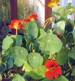
First I did a line drawing of the flowers.
Then I mixed my colors: Deep Orange, Golden Yellow, Light Lemon Yellow, Bright Green to start. Later I added Robin's Egg Blue, Bronze, Moss Green.
I began by painting the veins in the leaves with light lemon yellow, then used deep orange and a little golden yellow for the flowers.
Next, I painted the leaves using bright green with some thickener to give me lighter shades, and some moss green for the darker shades.
I let the piece rest overnight, covered with plastic. Then I used robin's egg blue in 2 shades to try and create shadows in the background. Big mistake! No way to paint it out, so I deal with it later. Meanwhile, I used Moss green and bronze to paint the background around the leaves and flowers.
Up until now, I was using a number 2 Bright paint brush, which gave me a good crisp line, and it was a good size for the details. At this point, I began to use a number 12 Bristle Flat brush to extend the background. While I was at it, I painted over the blue stripes... the best I could do to camouflage the stripes. Note to self: be very sure of what you want to do with dyes! If I were painting with acrylics, I would simply paint over them and no one would be the wiser!
I'm sure there is more I could do to this piece such as adding details with a fine point brush, but I think I am going to stop here and digest what I have learned. One thing I noticed was that I had varying thicknesses of dye, partly due to using other recipes than the one Kathy used. But I found that mixing a thinner batch into some that were thicker than I wanted helped to make them easier to use. Now my only concern is how well this piece will handle being washed after a thorough batch. I'll post an update after it's washed out, so stay tuned...


Nice work Judy. I really like the strong colors in this piece. The red and green really pop. I'm still a bit unsure of myself when blending colors, which you do so well. (That's why I'm taking a color class with Jane Dunnewold in October.) I also don't have the wide variety of dye colors you all seem to have. I guess we'll see what I can do with what I have.
ReplyDeleteThanks, Beth. And you're right... I have a large selection of colors I have accumulated over the years. My tie-dye biz quickly outgrew the 3 primaries, and I find it easier to buy pre-mixed colors rather than to have to mix the all from scratch. I will be interested to hear how you like the color class. I know many quilters who have taken classes to learn how to re-create specific colors with precision...
ReplyDeleteBTW, I forgot to mention in my post that I transferred my line drawing to the fabric by tracing with pencil over the drawing that was placed underneath the fabric. And I pre-soaked my fabric with soda ash and let it dry first. I am not fond of putting the soda ash directly into the dye, as it loses its strength too quickly. It took me about 3 days to complete this piece, and I was afraid the colors wouldn't last with the soda ash mixed in.
Nice work -- I love the photo (nasturtiums are a particular favorite of mine) -- The colors on the fabric are so perfect together.
ReplyDeleteI am interested to see what you get after you rinse it out -- especially where the blue stripes are. Dye painting is really different from acrylic -- you may just get some blue stripes...