A TECHNIQUE DRIVEN Blog dedicated to mastery of surface design techniques. First we dye, overdye, paint, stitch, resist, tie, fold, silk screen, stamp, thermofax, batik, bejewel, stretch, shrink, sprinkle, Smooch, fuse, slice, dice, AND then we set it on fire using a variety of heat tools.

Showing posts with label Tsukineko inks. Show all posts

Tuesday, March 8, 2011

Trying Ink on Fabric--Quilter Beth

I received my inks and have played with them a little bit. I haven’t had the best of luck with the projects, though. This first picture is of a character I thought I might “paint” with the inks and aloe gel after I saw Karen Silver's dragon. I didn’t get good color—the black turned out way too gray. (It is more gray in person than in this picture.) I didn’t bother to use any other colors of ink on this piece. I also could not control the bleeding (wicking) of the ink beyond the lines. I thought I might need to add more aloe to control the bleeding; but when I did that, the color got more pastel. I will be finishing this piece with textile paints (which I find MUCH easier to work with).
This is a picture of a fabric softener dryer sheet onto which I brushed some inks. The sheet did not hold up well to the friction of the brush; it tended to beard.
Last, I thought I’d try making some background fabrics and fabrics onto which I could add some layers. I wasn’t real pleased with those either. On the first one, I used “Potion No. 9” which is a product that is supposed to allow the inks to blend (like watercolors). It is Tsukineko's ink blending solution. It can be used with any water-based ink. The product says it is supposed to encourage migration of the ink. I sprayed the “Potion” over the entire fabric and found it didn’t do much. I then concentrated on one area (right-hand side) and sprayed it a bit heavier, which worked a little better. I also tried spraying the piece after I sponged on the inks…again, with little success. I ended up using an entire travel-sized bottle on this one piece. (The orange is a previous layer that had been screened on in my Jane Dunnewold class and is made with tempera paint.)
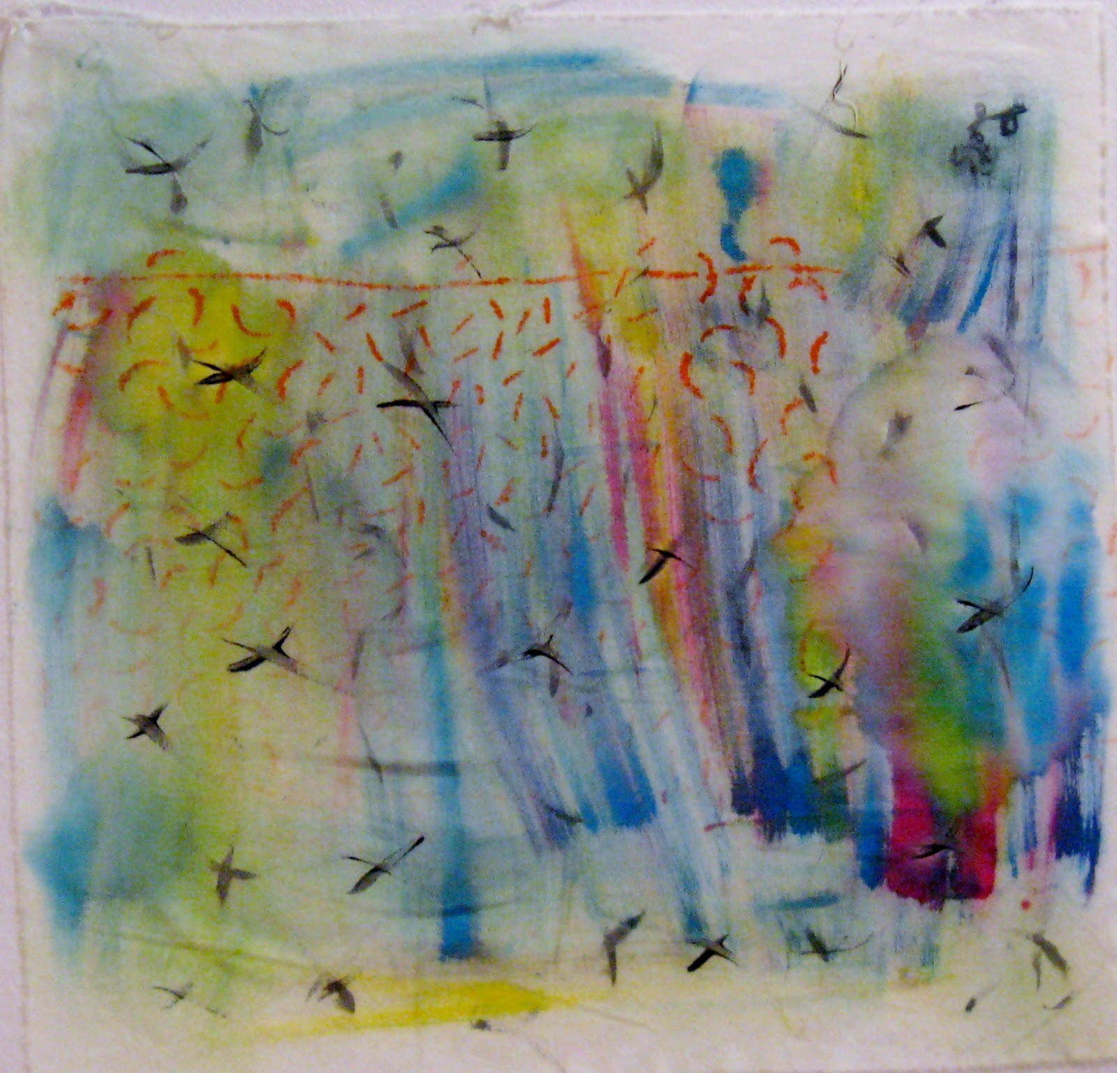
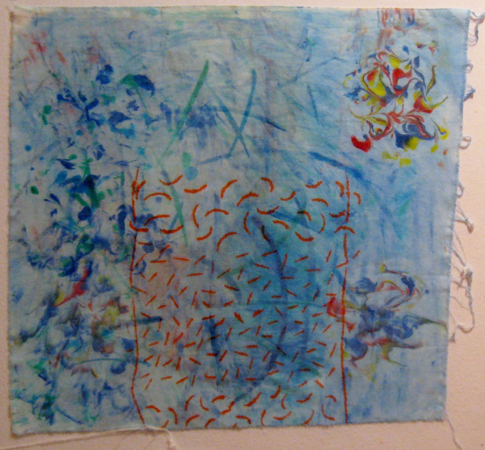
On the other pieces, I watered the inks down a little and sponged them onto the fabric. I also experimented with the inks and shaving cream. You can see my little shaving cream experiments on the right-hand side of the bottom picture. I also tried painting small sections of each piece with ink and aloe gel; and in some places, I dipped the Fantastix applicators into the ink and brushed on some ink. I was just experimenting to see what would happen.

 I have some other ideas about things to try...now, if only I could find the time...

Tuesday, March 1, 2011

Adventures in Ink

I am delighted to be the guest blogger here today.  However, I must begin by saying that I am no expert on inks.   I was invited to share my paltry experiences when I opened my big mouth (or is that typed with my big fingers?).  I have played around with Tsukineko all-purpose inks for a couple of years now.   My main influences were mentioned in the post below, "March's Technique." 


I have one other influence not mentioned in the previous post: Patt Blair.  Patt gave me permission to link here with her blog to show her color wheel.  She has done amazing work with these inks and she teaches classes, sadly though, never anywhere close to me.  
 I made this color key so that I can tell at a glance which color I need (try to ignore the mistake on number 33).  There are a couple of popular methods to using the inks.  They are very thin -- as in watery -- so it's possible to use a brush and get some nice watercolor looks.  I've been a little frustrated that they don't blend like acrylic paints because they're so watery.  Mixing them with clear aloe vera gel makes them thicker and easier to use with a brush.   
I used inks mixed with gel to paint this.  I traced the dragon from a Dover book with a thin pencil onto white cotton and used a brush to apply the ink/gel mixture.  I really like this method because it allowed me to mix colors on a palette like paints, but the inks don't change the hand of the fabric like paint does.   The only thing wrong with this was that I had to put it away for a while.  I forgot about it and when I remembered it, the ink/aloe mixes had dried out in the little bottles I used.  Maybe better bottles would have prevented this.  Or maybe a better memory...
My next big project was this portrait of my daughter.  I made a line drawing from a photo and covered it with a piece of very thin plastic from a dry-cleaning bag.  Then I taped it to the back of plain white cotton.  I referred to the color photo and used the "Fantastix" applicators to apply the inks.  It has a very "sketchy" look to me.  I started with the lightest colors and slowly went darker, layering the color.  I haven't really mastered smooth blending from one color to another with these applicators.  The background isn't finished; I am probably going to use textile paint because it seems to be the most efficient way to cover a big space. 
I mark my applicators with a Sharpie so I know what color I have used them for.  The color doesn't really rinse out of them, but they seem to work okay even after the ink has dried on them.  So I use a different one for each color.  And I store them in a  container with the point side down.
At the suggestion of Quilt Rat, I made up some samples using aloe gel painted on fabric,  then I blended the color over.  I allowed the gel to dry on the bottom two before painting on the ink.  I heat set (which is important with these), then hand-washed in the sink with Synthropol.  I left the picture large so it's obvious where the color flaked off.  The best blending was attained with a thin coat of aloe, then painting the ink onto the wet gel.  And the color stayed on the fabric.  
I made up these two samples using the same picture for comparison of the techniques.  The one on the left was done with the "Fantastix" applicators and the one on the right was done with a combination of techniques all using clear aloe vera gel and a series of paintbrushes.  There are things I like about each.  I find that the pointy "Fantastix" are really good for fine detail.  I had to wipe them on a scrap to get rid of the excess every time I dipped into the ink.  But they work really well for tiny details.  I like the more watery look of the background on the right.  I used gray for the upper part of the petals and I mixed the blues and yellows with the aloe on my palette, then painted those colors.  For the greens, I painted the background generously with aloe and painted ink on top of the wet gel.  
Here are the finished postcards with their stitching.  

Another thing to try with the inks would be to mix them with textile medium instead of the aloe vera gel.  The aloe is probably cheaper, but I wonder if the mediums might be more versatile?    It would be fun to experiment with all the different viscosities