A TECHNIQUE DRIVEN Blog dedicated to mastery of surface design techniques. First we dye, overdye, paint, stitch, resist, tie, fold, silk screen, stamp, thermofax, batik, bejewel, stretch, shrink, sprinkle, Smooch, fuse, slice, dice, AND then we set it on fire using a variety of heat tools.

Saturday, November 26, 2011

Multiple Experiments with Transperse Dyes

Thanks to Beth, I got a chance to play with transperse dyes today.  I prepared for the day by ordering the PRO Transperse Transfer Printing Kit from Pro Chem.  It had a small amount of blue, yellow, red, and black transperse dyes and the thickening agent to make a print paste.  I also scanned some tree leaves I had pressed, Photoshopped them to just edges, and printed the leaves onto thick art paper.  For the life of me I can't find the jpeg with just the edges--did I not save it???--but here are the scanned and printed leaves before I turned them into outlines.
 Once at Beth's, we mixed the thickener to make the print paste.  We added only half the thickening agent before we both agreed that it was way too thick already and we quit.  Like Beth, I mixed my dyes powders with boiling water.  I chose to mix dark concentrations because I figured I could always water them down.  Next I mixed the dye concentrates with the  print paste.   Then we started with the experiments.


Experiment 1: Transfer printing of painted pictures.
I painted the leaves from the outlines I had printed before.  Here is a picture of them painted on the paper.  

Here is a picture of them on the polyester silk that Beth provided.
 Lessons from Experiment 1:  When comparing my results to Beth's, copy paper and unthickened dyes transferred much better than thickened dyes on art paper.


Experiment 2: Transfer printing using a mask. 
I painted several sheets with stripes of dyes and then used some more of my pressed leaves as masks.  Here are some of the results from that experiment.


Lessons from Experiment 2:
Coolest thing I learned here is that the transfer dye would transfer to the mask. That meant I could turn the mask over and print directly from it.

Experiment 3:  Transfer printing from thermofax
At this point I had left over thickened dye and Beth had some lonely thermofax screens.  I put them together and printed on paper.  Here are the results when printed onto the fabric.

Lessons learned from Experiment 3:
I don't know if I would have better success with a different type of silk screen or if I had screened onto copy paper but these did not transfer well and only transferred once--see the very faint leaves on the second picture?  That was my second attempt to print.  Quite unsatisfactory.

Experiment 4: Going wild now
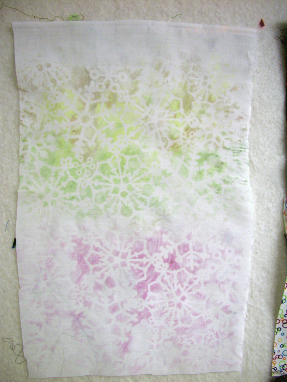
Okay, at this point I was having tons of fun layering the prints.  Because they are translucent and because I could print directly from the masks, I was just making  multiple layers of the same masks/transfer papers in multiple ways. So Beth painted a motif and I started transferring the motif across a width of fabric.  Here are pictures of the progress. (Sorry about the shine--wasn't there in person)


Overall Lessons Learned
1)  By the time I finished playing today, I decided that I do have a few more experiments that I want to try.  It is kinda fun.


2) There are effects you can get using the transperse dyes that you could not get from paints or direct computer printing on the fabric.

Overall, I am still on the fence for this technique.  One of the pieces I made today will become a wall hanging.  We'll see how the quilting goes to see if I am interested in working with polyester in the future. At this point  I have used cotton/silk/linen fabric for so long that I am not sure why I would want to use polyester fabric and if I don't use polyester fabric then this technique is pointless.

I will let  you know about the quilting and any future experiments.

Transperse Dye Play Date

I love playing with Judith. She is so much fun to watch when she goes on a roll with her creative ideas.
Well, I was feeling a bit guilty about not getting to the transperse dyes sooner but Judith came over a rescued me. She will be talking about how she used the materials and I will talk about how I used the materials. I added 4 teaspoons of dye powder to 1/2 cup of boiling water and stirred. I made blue, yellow, red, turquoise and black. I decided that I wanted to do sketches in dye paint so I used a sketch I did earlier for my altered books project and printed an enlarged photo of a crow. I painted over the pencil lines on my sketch with what I thought at the time was black (note to others: LABEL as you mix). I used printer paper. This formula was a bit darker than the medium recipe (3 teaspoons per 1/2 cup). I also made two sheets with just overall color. I wanted to see if the colors were transparent. When I painted red, then yellow then blue with overlapping sections, the transperse dye/paint didn't BLEND making green and purple. I wanted to see if when heated they would blend. They did and quite beautifully. On one of my crows (the one from a photo), I used 3 values of the same color dye/paint. Again I thought I was using black.Here are my results:
You can clearly see the 3 values of blue
This was more sketchy
The ghost is another print under neither it showing through the fabric. Ignore the man behind the curtain.

Too little heat on the bottom
See how light I made the feet? The dye/paint was very watery and you can see the other differing values in the birds body and wings. That was what I was going for.
This one (above) was ruined by steam iron vent holes. That was the first print. We quickly plugged in my solid sole plate iron. You can clearly see the orange and green above.

This was our set-up (below)


OK. This is my 2 cents.
1. These transperse dyes really smell B A D and I mean stink. The stunk up the whole kitchen during the mixing process and every time we opened a container of mixed fluid dye the smell was awful.I have a massive exhaust fan within inches of our ironing surface so there were no fumes we noticed during the ironing part but I bet we'd be choking up a storm without that fan.
2. I thought they were no big deal although I can tell you Judith had a ball. I will probably never use them again - really
3. It was messy since they were fluid however the mess washed right off easily mostly without staining anything.
4. The way I prepared and applied the dye was way easier than Judith's way - she was following direction.
5. I think there s a huge difference between transfer and transperse dyes. Mine were easy to use and I painted on copier paper and got tons (10-15) prints off each sheet.
Stay tuned for Judith's blog post coming up soon.

Monday, November 21, 2011

More experiments and play


So, for this piece, I took some of my dried painted papers, cut them into the above designs, laid them on my cloth, and then ironed a yellow-green painted paper over top of them to achieve the above result.  I think I'm going to go over it again with a green and/or blue paper as well to get a more nuanced result.


For this piece, I cut some papers into triangle shapes and ironed them onto a piece of cloth for a cute piece of fabric. More, after the jump:

Sunday, November 20, 2011

Transfer Paints - First Try - Karen


I finally mixed them up and tried them.  The first two photos are the results on some sheer poly stuff.  One is from the "fancy" section of the fabric store and the other is leftover from Halloween.


The fabrics are really sheer (you can see threads stuck to my design wall showing through).  I think this would be fun used as a technique to put color on some kind of an overlay -- it's very subtle.  I plan to experiment a bit more with these.

 This was the poly satin from the "fancy" department -- all this fabric was on sale and not terribly expensive.  I took a cue from the comments on the previous posts and placed a piece of laser cut paper from the scrapbooking department over the painted paper as a stencil.  The color is slightly darker than it looks on my monitor.
And this was my favorite.  I did it in two sections, using two different painted sheets.  The fabric is a 70/30 poly cotton blend and gave me the best color -- although I may have just gotten the hang of it as this was the last one I did.  I really like the color showing through the stencil.

I have to admit, I was dismayed when I mixed up the colors -- the yellow looked kind of brownish and the blue looked purple.  When I mixed the two, the color was muddy.  I was pleasantly surprised at the change in color on the fabric.  I have a bunch more paper painted up, so I'll be playing with it a bit more before I'm finished.  I'm thinking of painting an image, then trying to transfer it.  

Saturday, November 19, 2011

Gather Supplies for the December Technique--Quilter Beth

Originally, I had wanted to do some discharging with bleach for the December technique, but because of the ventilation required for this technique and considering the weather that most of the group must deal with in December, I decided it would be better to do that in the spring. I know that the holidays are a busy time for almost everyone, so I thought I'd come up with a technique that doesn't require a lot of supplies or time.

I don't know about you, but I like to recycle whenever I can. Well, we are going to do a bit of recycling of plastic shopping bags in December. I have a plastic bag "stash," and I know my husband will be glad for me to get rid of some of them. I think you all already have everything else you might need to embellish the bags. So...be collecting those shopping bags. I'll post detailed information about the technique in December. We might even be able to finish some gifts for friends and family before Christmas (if that is a holiday you celebrate).

Friday, November 18, 2011

Thursday, November 17, 2011

Experiments continued...


I have been working on other experiments over the past couple of weeks with transfer paints/disperse dyes.  For this piece (36 x 24 or so), I couldn't pick up the gloriously glossy effect that this fabric has as I'm not yet that skilled a photographer - but it's really lovely. 
For this piece I tore the painted papers into pieces and then laid a piece down, ironed it, laid another piece on top, ironed it  -  with a fairly light hand onto the fabric, a quite laborious proces, but a result I was quite pleased with. 

Saturday, November 12, 2011

Disperse Dyeing--Quilter Beth

I finally had a chance to "play" with disperse dyeing. I had never even heard of it before, so it was something TOTALLY new to me.  I purchased a 100% patterned polyester table cloth thinking the pattern might produce some interesting results, and my friend had a "Transfer Printing Kit on Polyester using PROsperse Disperse Dyes" from ProChem on hand. The kit included 10gm Yellow D118, 10 gm Bright Blue D459, 10 gm Red D360, 75 gm Thick F (used to mix the thickener paste), and 50 gm Metaphos (also used to mix the thickener paste). We mixed some dyes to get a purple and an orange so we'd have more variety in color. We really had fun painting the papers with the thickened dyes. For all the papers, we did one layer and let it dry (which took way longer that we thought it would), then we did another layer of dye on top of that.

As you can see, my first results were terrible. Hardly any color came off the paper onto the cloth. I started ironing the papers from the top right...then down...back up to the top...then down, etc. On those first two, I followed the directions that came with the basic transfer printing kit. Those instructions said to "set the iron at the top of the polyester range and iron for 1 minute for a pale shade and up to 5 minutes for a dark shade." I ironed both of those for more than 5 minutes at that polyester setting without good results, so I upped the heat to a cotton setting and increased the ironing time on all of the other pieces. I ironed each succeeding piece for a longer amount of time with much better results.
My friend and I each did several small "prints." The painted papers are on the right of each of my samples (except for the one in the bottom left-hand corner). That print is a reprint of the second paper on the right using more heat and a longer ironing time. Wow, what a difference!
 This is my first attempt.
 This is my second attempt.
 Here is where I upped the heat setting on the iron and ironed for a longer time. The background was painted first, then I used a stamp to make the yellow image.
You can really see the pattern on the table cloth in this print. I painted the background of this one and used yellow dye on bubble wrap to make the design.


I also used bubble wrap for this print.


My favorite pieces are the images where I used bubble wrap. I'm planning on overprinting some of the designs I'm not crazy about with other designs. I like that effect (see Robin's images below). I've been thinking of ways I might use pieces of these samples...stay tuned.

These are the samples my friend did.
Robin painted, stamped, and overprinted some of her designs.

This was an enjoyable experience, but I don't think it is something I'll use frequently. The long ironing time made it really tedious for me.

Monday, November 7, 2011

Friday, November 4, 2011

Great book

Here is an entire book about transfer (Transperse) dyes

Here we go...!

The basic technique is as follows. 

  1. Mix your disperse dye according to the directions and/or mix your transfer paint
  2. Paint your paper (Let dry thoroughly)
  3. Iron onto your fabric
  4. Enjoy the results!

There doesn't seem to be a lot of available reading about transfer paints/disperse dyes - a lot of people seem to use it, but almost none seem to talk about how they do it. I ordered a booklet from an artist who offers courses in the technique, but was quite disappointed with the result - the directions were pretty much what I gave you above, and lots and lots of pictures of what she did with the technique, and no information as to how those results were achieved - other than labels like "layered disperse dye".  *ahem*  Nonetheless, I found four or five people online who gave sketchy outlines of what they did, cobbled them all together and gave it a whirl.

Wednesday, November 2, 2011

Where to buy:

Beth Berman kindly provided us with an option of where to buy the paint materials:


I'm sure it's not the only place in the US to buy them, (and this is in now way an endorsement)  but it's a good start!

Tuesday, November 1, 2011

November Technique

For November's technique, we're going to be working with transfer paints/disperse dyes.

The materials you'll need are:

transfer paints (I'm using G&S Dyes) and/or powdered disperse dyes (I'm using iDye Poly)
good quality paper
a variety of brushes/sponge brushes
Man made fabric that is at least 60% non-natural materials
an iron (preferably without steam holes)
a variety of resists - whatever floats your boat

I can't give you advice on where to purchase, because I live in Canada and my sources will be different than most of the readers on this blog.

Here are some examples of what can be done with this technique:


Gurli Gregersen produced this whole cloth quilt by using the transfer print method, which augmented with paint sticks and fugitive media.


"Loli Girl" at the Quilting Arts website produced the rocks in this piece by using powdered disperse dyes on interfacing.


And Marie-Therese Wisniowski produced this example using resists and disperse dye.

I'll give you a few days to gather materials and then we'll begin.

P.S. I was editing my first post and managed to delete it - my apologies to the two of you who had already responded!