A TECHNIQUE DRIVEN Blog dedicated to mastery of surface design techniques. First we dye, overdye, paint, stitch, resist, tie, fold, silk screen, stamp, thermofax, batik, bejewel, stretch, shrink, sprinkle, Smooch, fuse, slice, dice, AND then we set it on fire using a variety of heat tools.

Sunday, September 30, 2012

My Turn At Dye Painting

Well, it took me the whole month but I finally got a chance to try dye painting.


 Here is the picture of the daylily that was an  influence for the first picture and here are some progress pictures.  I used a yard of fabric ripped into 4 pieces.  I drew an outline using charcoal because I thought it would wash out nicely.


And here is the fabric washed out, dried, and ironed.
I tried a second floral picture.
 
I thought I would love this technique but not so much.  That was not the technique's fault but my choice of subject.  I tried painting in a more realistic style and I don't like the constraint of doing that.  I made a bad choice.  Since  I was tired of trying to draw pictures  I just dumped the dye out of my little containers and just spread it around.  Frankly,  I can only handle trying to be controlled and close to reality for so long before I have to rebel.   I liked the result so much that I spread a second piece of fabric on top of it and to make a print of the original.  Here they are.
THAT IS MORE LIKE IT!

Monday, September 24, 2012

WE ARE IN QUILTING ARTS MAGAZINE THIS MONTH


I had to fidget to try to get the article big enough to read. I know it looks stupid but the choices for sizes of the images are limited so lets just be happy with this. The article is in this months Quilting Arts Magazine starting on page 72. "WE" appear on page 75 - "Virtual Connections" about Five, the original 5 members from Maine who started this blog: Judith DeMillo Brown, Beth Berman, Rosalita Feero, Kathy Molach and our only none computer member, Charlene Huntly. This blog has grown over the years becoming the robust site which has had contributing members from all over the US, one from Canada and now Neinke Smit from the Netherlands.

I know this MAY be hard/easy to read but I DID want people who do not get Quilting Arts Magazine to be able to enjoy the article about the blog creators.


Sunday, September 23, 2012

Painting with Thickened Dyes--Quilter Beth


I finally had a chance to try painting with thickened dyes this weekend. I have to say up front that I am NOT a painter in any way shape or form. That will become abundantly clear after you see my attempt at this technique. It was VERY intimidating to try this technique after seeing the beautiful work of my fellow resident artists. 

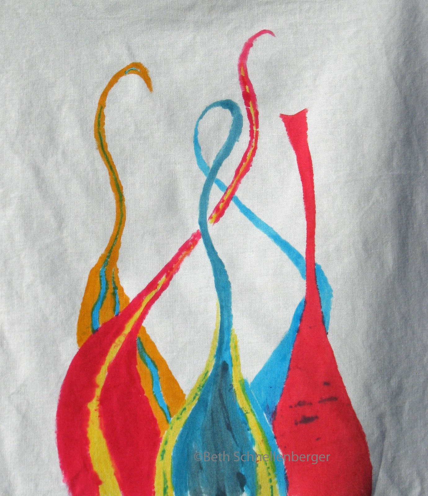
I looked through my sketch/idea book to come up with a drawing I could paint. This drawing was inspired by photographs I took at an exhibit of Chihuly  glass. I LOVE the flow of the molten glass and tried to capture that in my piece.  According to the tutorial, the thickened dye should stay wet so it can batch properly. That was the hardest thing for me; I’m sure it didn’t stay wet. I tried to cover it as I went with small pieces of plastic, but that was next to impossible for me. 

I let it batch overnight, and this is my rinsed and dried piece. I guess not keeping it really wet didn't make a big different in the end, because the piece kept great color. I'm hoping with some quilting and thread painting it will be something I can use.
 I wanted to test the colors on a piece of cloth before I painted anything, so I used this next piece for testing and cleanup. (It was soaked in soda ash first.) It isn't great, but I did find that I LOVE the texture the wrinkled fabric and paintbrush made. I will be trying that again with a more controlled color palette.
I’m glad I tried this technique and now have it in my arsenal of tools, but it is not one I anticipate using frequently. I find that I have much better control (and WAY less mess) when I color a drawing on fabric using fabric paint.

Lesson 1 - don´t use too much water

Ok, my turn, I saw a landscape with tree in a painting-for-dummies book (see right), and managed to mix exact the right colours with just yellow/turquoise/red procion powder. Yeah, so far so good.


Set up the table, and felt like a real artist, painting my landscape:


Happy with the final result:

Ready to add a tree by machine, but wait a minute, I had to rinse and wish it first:


Oooph, that´s not exactly what I hoped for, although there is a misty sun glaring at the horizon ;-).
Lesson learned, I mixed the original thickened procion paint with too much water to work like an aquarel.
Better not do that. Just use the original paint, and you will not loose the colourdeepness.
Fortunately, I did some printing with the remains, so I can prove that pure thickened procion can stand the rinsing/washing if used properly;-):


Have to retry this, it is big fun to do!

Thursday, September 20, 2012

Dye Painting Stuff from Karen


I took a class with Hollis Chatelaine a few years ago and did this picture of my daughter and our dog.  I like it, but I never finished it because I wanted to make it bigger and never could decide how best to do that.

Hollis had me mix the dye for my daughter's skin darker than I would have, assuring me that "it will come out much lighter than you think."  She was right about that.  But I hadn't really worked with portraits and/or pre-mixed dyes much.  I'm not crazy about DD's eyes, but Hollis assured me that a lot can be "fixed in the quilting."

Lately, I have been working on a series of quilts for a show this winter with Madison Contemporary Fiber Artists.    This was painted with thickened dyes on cotton.  I just finished the quilting.  I used a bit of foil over MistyFuse to make the beetle shiny.


And this is the fourth piece in the hibiscus series.  I mentioned it here earlier -- here is a link to the process: http://cre8tivekick.blogspot.com/2012/08/tell-all-scoop-on-resistdye-painting.html

I used a flour resist and painted the thickened dye over it.  Again, I used the foil thing for the beetle.  

Monday, September 17, 2012

Nasturtiums - after laundering

After laundering, I would say there was very little fading, which is good.  I think I will try to use a larger brush for any future pieces for the shading... the areas around the leaves and flowers look sloppy to me next to the areas where I used the larger brush to extend the background colors.  And I'm not sure I will do any more to this, although it would be a good candidate for doing some free motion stitching to add details.  All in all, this is a good technique and I'm glad I gave it a try,  I can't wait to see what the rest of you do painting with thickened dyes!

Sunday, September 16, 2012

My dye painting experiment

I have used thickened dyes in various ways for the past few years, but I think this is the first time I have tried using them for a realistic rendering.  Years ago, I painted with acrylics and enjoyed the process, but I haven't done any painting for over 25 years, so this was something I wanted to try.  For a subject, I chose a photo I took of a Nasturtium plant that grows in a pot on my deck:

First I did a line drawing of the flowers. 
Then I mixed my colors: Deep Orange, Golden Yellow, Light Lemon Yellow, Bright Green to start.  Later I added Robin's Egg Blue, Bronze, Moss Green.

I began by painting the veins in the leaves with light lemon yellow, then used deep orange and a little golden yellow for the flowers.
Next, I painted the leaves using bright green with some thickener to give me lighter shades, and some moss green for the darker shades.
I let the piece rest overnight, covered with plastic.  Then I used robin's egg blue in 2 shades to try and create shadows in the background.  Big mistake!  No way to paint it out, so I deal with it later.  Meanwhile, I used Moss green and bronze to paint the background around the leaves and flowers.
Up until now, I was using a number 2 Bright paint brush, which gave me a good crisp line, and it was a good size for the details.  At this point, I began to use a number 12 Bristle Flat brush to extend the background.  While I was at it, I painted over the blue stripes... the best I could do to camouflage the stripes.  Note to self:  be very sure of what you want to do with dyes!  If I were painting with acrylics, I would simply paint over them and no one would be the wiser!
I'm sure there is more I could do to this piece such as adding details with a fine point brush, but I think I am going to stop here and digest what I have learned.  One thing I noticed was that I had varying thicknesses of dye, partly due to using other recipes than the one Kathy used.  But I found that mixing a thinner batch into some that were thicker than I wanted helped to make them easier to use.  Now my only concern is how well this piece will handle being washed after a thorough batch.  I'll post an update after it's washed out, so stay tuned...