A TECHNIQUE DRIVEN Blog dedicated to mastery of surface design techniques. First we dye, overdye, paint, stitch, resist, tie, fold, silk screen, stamp, thermofax, batik, bejewel, stretch, shrink, sprinkle, Smooch, fuse, slice, dice, AND then we set it on fire using a variety of heat tools.

Wednesday, March 30, 2011

Layers of FW Acrylic Ink
by guest blogger Terri Stegmiller


I recently discovered a product that I've fallen in love with. FW Acrylic Inks. These little jars are like colorful love to my eyes. They are very vibrant and rich and fun to play with.

One of the first things I usually do when I add a new product to my studio is to create a color chart. Usually the color appears a little bit different on fabric or paper compared to just viewing it through the bottle it is stored in. This color chart is different from the charts I usually make. For this chart I wanted to show how the colors interact with each other when layered.

When layered, the inks mingle and blend and create more colors. Although some of these inks are opaque, I have found that when they are diluted with some water, they become a bit more transparent. I don't usually use the inks directly out of the bottle as I find them too deep and saturated for my needs. Instead I will mix the ink in a mixing cup with water. The amount of water I use depends on the look I desire. Usually I will dilute about 50%. Because I usually apply two layers of color to my fabrics, the 50% solution works well and I am still achieving very bright colors. You can see an example of two layers in the next photo.

This quilt started with one layer of FW ink color. I then added all the black detailing with both a Pentel Gel Roller for Fabric and FW Acrylic Ink in black. Then I painted on the second layer of background color with more FW inks. The flower and leaf interiors were not painted with a second layer and you can see how adding another layer heightens the vibrancy of the colors.


Recently I started experimenting with using the FW Acrylic inks in place of fiber reactive dyes when using resists.


In this first piece, I started with white cotton fabric and applied a water-soluble gel glue design. After the glue dried I painted on the inks and let it dry. I then added another layer of inks and let that dry. After heat setting with my iron, I soaked the piece in warm water until the gel glue was dissolved away. I was somewhat disappointed in that some of the ink color washed away and left the piece looking washed out. If that is the look you want, then this method/technique might be good for you. The washed out look is hard to see in the photo, but in real life it is very noticeable.

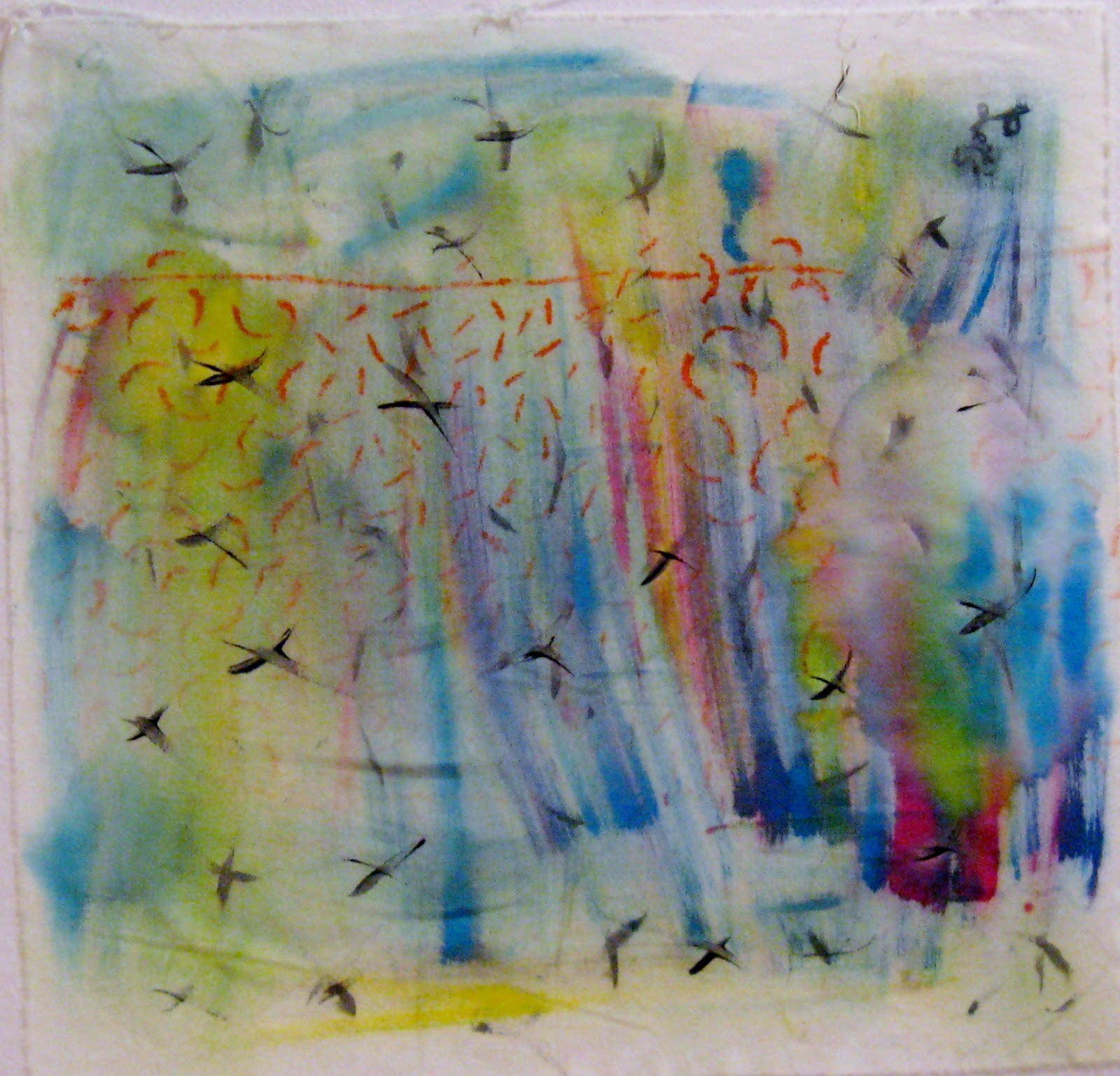
Another resist technique I like to use is with a water-based gutta. This gutta is designed for silk, but I like to use it on cotton. It is available in several colors, but my favorite is black. I applied the black gutta onto my white cotton fabric and let it dry. Then I applied two layers of FW inks letting them dry between layers. I don't remove this gutta when I use it so after ironing the piece I was ready to use it in my project. Here it is made into a wall quilt.


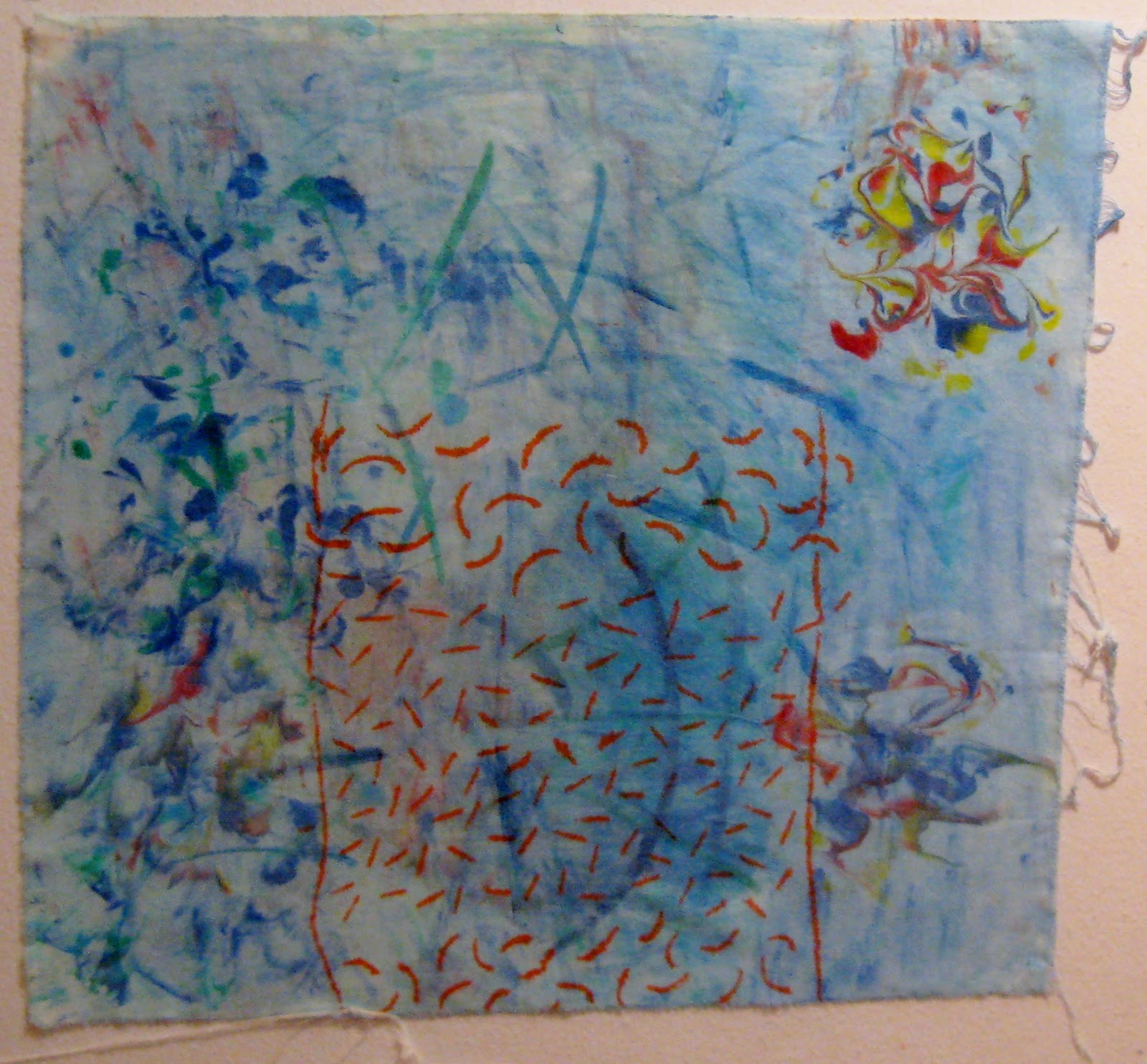
One more resist technique I've tried is a Shibori technique. This is a technique I recently learned from Brenda Gael Smith. With this resist, I started with a white piece of cotton fabric. I then marked circles onto the fabric and stitched a running stitch around the markings. The threads were then pulled tightly and knotted.

I then wet the knotted fabric piece and squeezed out as much excess water that I could. I applied two colors of ink randomly over the fabric and let it rest for a couple of hours. It was still very damp after this period of time and I then applied a couple more colors of ink. The amount of ink I applied was not excessive, in that the fabric piece was not sitting in pools of ink or liquid. I let the fabric dry. This can take a while since the fabric is knotted and gathered. I removed the knotted threads and after ironing, this lovely piece of fabric is my result. I love the way the colors are intermingling and creating such interesting patterns.

I think I am at the tip of the iceberg with my experiments and play with these inks, which is good because I've barely made a dent in the ink levels in my bottles. I know I will continue to explore further with them and see what they, and I, can do with them. They are very versatile and while there are other products that can simulate what these do, I think the vibrancy factor of this product is what will be the deciding factor when I am planning a project.

Thank you for inviting me to be a guest here on your blog.  I look forward to watching your continued experiments and results with all that you do.

Terri Stegmiller
Edited:  You can find the Shibori technique tutorial mentioned above and many other techniques and projects at 3 Creative Studios.  Look on the Free Projects page here.

Monday, March 28, 2011

Guest Blogger

Terri Stegmiller has graciously agreed to end the month of working with inks with a guest post on March 30.  I asked her to relate her comments to working with inks in some way but, other than that, left the subject up to her.  If you would like to take a look at her work before reading her blog on Wednesday, check it out here.   It is an interesting read because Terri is into so many things--knitting socks, doodling Zentangles, journal quilting, and making ATCs and postcards, just to name a few.  Enjoy!

Judith

Tuesday, March 22, 2011

Parfait Dyeing


Parfait Dyeing


I chose parfait dyeing for my April technique. I own a little fiber art business called Stoney Ridge Fiber Arts that I presently run out of my home. The main trust of my work is art quilts or what I call wall art. I love this technique for dyeing fabric and use it in the background of my pieces.


This is one of my pieces where I used a parfait dye for the background and some of my hand dyed fabric for the leaf. I find using the hand dyed fabric enhances the joy of making art. The process is simple and anyone can do it. I am going to try to give you what you need for instructions to be able to accomplish beautiful fabric to use.

(Side note..... the stamp on the bottom is one I made and it says dragonfly)


First I would like to give you an abbreviated list of safeguards.

  • Do not eat, drink, or smoke in areas where dyes and chemicals are used.
  • Work in well ventilated area.
  • It is wise to use newspaper, plastic tablecloths, etc. to protect your work area. (Ask me why I have pink, blue and other colored grout on my tiled counters.)
  • Wear a disposable dust/mist respirator if you dye fabric only occasionally. If you dye fabric on a regular basis, wear a MSHA/NIOSH approved respirator with cartridges for dusts, mists and fumes.
  • Contact wearers should be careful around powders to avoid eye irritation.
  • Wear rubber gloves to protect hands.
  • A complete list of safety rules can be found on the ProChemical website (www.prochemical.com)Below is a list of items you will need to do Parfait Dyeing:
Bulleted List
This is the bare bone material list that you need:
  • Dust/mist mask or respirator
  • Funnels
  • Measuring cups and spoons
NEVER USE ANY UTENSILS THAT HAVE BEEN USED IN THE DYEING PROCESS FOR FOOD USE AGAIN.
  • Soda ash
  • Mixing cups
  • Mixing sticks (I use chopsticks)
  • Soda Ash
  • Something to wipe up spills. (Sometimes I use a piece of fabric - it turns into a nice piece to work with.)
  • Rubber gloves
  • Dye remover for your hands. (ReDuRan)(Not mandatory...it will wear off eventually...LOL)
  • Fabric (100% cotton)(I use Southern Belle fabric made in China. You can get it from JoAnn on line.)
  • Dye (I use either procion mx dye from ProChemical or from Dharma Trading Co.)
This is a list of items you will need for this project. If you get bit by the dyeing bug, you will want to research to see other items that make dyeing easier.


Parfait dyeing is a form of low level submersion dyeing.

Soda Ash Solution

(This makes one gallon - cut recipe for less)

1 gallon of warm tap water (between 75 degrees and 95 degrees F)
1/2 cup salt (non-iodized)
1/2 to 1 cup of of soda ash (Can be purchased in pool supplies in some stores)

Dissolve soda ash and salt in the water.

Dye Solution

(This makes 8 oz of dye solution)(USE YOUR MASK HERE)

1 tablespoon of procion mx dye
Make a paste with the dye and a small amount of plain warm water( again in the 75-95 degree range) in a one cup measure and try to make sure that all the powder is mixed in and then fill to the one cup line and gently mix again. (I store my dyes in plastic bottles with a spouted cap.)


  1. First prepare you fabric by washing in hot water with a little synthrapol. (3 fat quarters)
  2. Use a screw-top quart containers or a container that will hold a quart for your dye container. I use a screw top plastic quart freezer container. The idea is to have a fairly small container with straight sides.
  3. Wet one fat quarter with 1/4 cup plain warm water in your dye container. You may scrunch or twist or pleat the fabric to get different design results.
  4. Decide how dark you want your fabric. Put the amount of dye from the following in an eight ounce cup. I use a 250 ml beaker or equivalent. (See above)
  5. Pale = 1 drop of dye concentrate
  6. Medium = 2 teaspoons dye concentrate
  7. Dark = 2 tablespoons of dye concentrate
  8. Darkest = 4 tablespoons dye concentrate
  9. Add plain water to this cup to make a total of 1/4 cup (60ml) of the dye liquid.
  10. Pour this solution over the wet fat quarter and press down to distribute the dye. If you want a more solid design, move the fabric around a bit. I like the spontaneous result so I do not move it around.
  11. Measure 1/4 cup (60ml) of soda ash solution and pour this over your fabric.
  12. Wait ten minutes; wet another fat quarter with plain water and arrange it on top of the first layer.
  13. Follow steps 4 -12 for this layer.
  14. I often will stop at two layers because I like the way they come out. However, it is intended for three layers.
  15. Follow steps 4 - 12 for the last layer.
  16. Let the parfait sit for at least one hour after the last layer of fabric and soda ash solutions is added. Press or turn the top layer a couple of times during this time. Fabrics can stay for overnight for stronger color. I usually can not wait that long.
  17. After the setting time, pour off the excess dyes and then rinse in cold and wash with some synthrapol in hot water. (This can be done in the washer with synthrapol and a color catcher added.)
  18. Dry, iron and enjoy.
These directions are courtesy of Ann Johnston's book "Color by Accident".


First Layer.


Yellow dye and soda ash added. (I used Pro Chemical Dye Sun Yellow, #108)


Blue dye and soda ash added for second layer.( I used Pro Chemical Turquoise # 410)


Last layer dye and soda ash added. (I used Pro Chemical Deep Navy #414)


Here we are just waiting to exhale :o)


You really didn't think I could stop at one did you?

TAH-DAH

Bottom layer:


This layer was folded like a fan and then twisted before putting in the dyeing container. You will note the difference in this layer and the next.


Layer 2
This layer was just scrunched up and put on top of layer 1.


This is the top layer. You can see that the top layer does not have any yellow and is much more muted.

All that know me know that I am a what-if kind of gal. So I thought "What If". Here is what happened.


I took only 1 piece of fabric and squirted multiple dyes on it.

I also like to use cheesecloth on my art projects, so, I put a piece of cheesecloth in with all the dyeing I did.

Here are the results:


I hope you have enjoyed this technique. PLEASE, if you have any questions please let me know. You can get a starter kit for beginning dyers at the following link for $19.50:


Saturday, March 19, 2011

Acrylic Inks on Fabric

I am guest blogging here again and this time I am sharing my latest experiments with acrylic inks.  The company that makes these has a website here that provides more information than I needed.  Which is a good thing.  They're like regular acrylic (textile) paints, except much thinner.  And I think they act like they have more pigment then the acrylics I usually use.
I was able to find them locally at my favorite art store.  First, I made a chart.  I played around with mixing them here and discovered that the "primary set" I purchased didn't make a good purple.  So back downtown I went where I purchased Prussian Blue and two (!) purples (Purple Lake and Velvet Violet).  I also couldn't resist one Pearlescent -- Mazuma Gold.

First I played around with diluting them with water and brushing them on dry fabric.  I added some salt (kosher) to the wet paint for fun.  These inks blend very nicely.  And it takes a lot of water to dilute the color.     
This was done with full strength inks dropped on a palette and brushed on with a small paintbrush.  Both of these were a little stiff after drying, but I let it cure overnight and ironed to set them and they softened right up.  Not as soft as the Tsukineko inks, but much softer than regular acrylic paints.  And the pearlescent was fine here in a thin coat --it's in the center of the flower, the nest under the bird and the center of the paisley shape.

 These inks have droppers in the caps.  I think this is wonderful!  Instead of pouring out the inks onto the palette and getting ink all over the side of the jar or pouring out too much and wasting it, you can drop it onto the palette.  And there's no need to dip a wet brush into the jar and pollute the whole jar!

So I wet a piece of white cotton and crumpled it, then spread it out onto a paper bag.  I dropped inks onto the fabric and let them spread.

The only thing I didn't like about this was that the Pearlescent Gold cracked and peeled off after heat setting.  In their defense, the company says that the Pearlescents aren't designed to withstand high temps or washing.

I don't usually like pearlescent paints anyway, but I just could not resist the gold.  It's been so dark and dreary....


This is the bag that was under the fabric when I dropped on the paints.


And these are the parrots.  I painted them on dry fabric with brushes.  I had no trouble getting fine detail with a tiny brush and undiluted inks.  I did have trouble with inks spreading all over when I diluted them.  The background on this piece is a couple of tablespoons of water with two or three drops each of black and Velvet Violet.  The Velvet Violet isn't categorized as a pearlescent, but it does have some sparkle.  There is not much ink in the water, but it turned out very dark. And I had a lot of trouble with bleeding -- so I learned to keep the brush far away from my painted birds and wait for the ink to quit spreading.  I really like the mottled effect I got in the background. 

Thursday, March 17, 2011

Experimenting

A belated Happy St. Patrick's Day!

Here are a few experiments with the Tsukineko inks:
I was playing with a water color technique using a brush, just trying to see what the inks would do on this piece of poly/cotton sheeting (cut straight from the sheet and not washed).  It took the color well, but because I was working on a plastic background, I didn't get the blending that I wanted....lots of texture from drying it on the plastic, though.  Dried with a heat gun.  Want to do more of this sort of painting on cotton.

Just dubbing around with the Fantastix.  This is on cotton pfd.  I love the way the pens gave me so much control of the dots.   The pen with the blue ink had a split tip which allowed me to make the little 'tracks'.  This has possibilities!

This is the end of a silk habotai scarf, 10mm.  You can see where the silk pins held the fabric to the frame because the ink doesn't penetrate or flow nicely like dyes do.  I was using the inks to paint in the serti technique with gold gutta (fancy, but overwhelming).  The inks behaved a bit like silk paint or dye when I initially laid them on, blending quite nicely.  However, because the inks don't penetrate the fabric very well, so the other side looks like, well, the other side, somewhat dull and lackluster.  The black ink was disappointing as it lost most of its intensity when it dried.  I have 4/5 of this scarf left to experiment on, so stay tuned!


Monday, March 14, 2011

Diva's Weekly Challenge and Gel Pen Review

I have decided to accept the Diva's Weekly Challenge for a Zentangle drawing.  I thought it would be a great double exercise (use of ink on fabric and drawing class skills).  Here is a picture of the Zentangle I made on Saturday during the Play Date of the FIVE.  The challenge was to incorporate blue in the Zentangle.
This is a piece of cotton I shibori dyed in January with Cerulean Blue.  I had originally planned to draw zentangles only where the white was but the right hand side of the material had very little white and was looking lonely.  I went ahead and drew some zentangles there and will go back and put a little bleach in them to see if I can lighten the inside some. 

The reason I am posting the zentangle here is that I used the Pentel Gel Roller for Fabric pen to create the Zentangle and wanted to give a review of it as part of the ink month.  The pen and I have a love/not-so-much relationship.  It has a broad tip--1.0 mm.  That gives a wonderful line but tiny details are not achievable.  The black is very black and it does go on the fabric very smoothly.  I have not yet washed it so I can't comment on the permanence of the ink.  My biggest problem is that the pens do not last long.  This Zentangle of 8" by 14" used one complete pen's ink--I started with a fresh pen and it was ink-empty when I finished.  The pens aren't all that expensive-- between $2 and $3  I think--but the idea of having to use dozens of pens to finish a larger project seems a bit much. 

Rosalita had other gel pens which were not especially made for fabric that I tried when my pen ran out.  I would think that once you use them on fabric and paint them over with a textile medium they would also be reasonably permanent. (I have not tested that theory yet). They did not go on quite as smooth as the Pentel but were not bad. They covered well.  I couldn't get as strong of a black using them but then I had lots of other colors to choose from (the Pentel had 3 colors I think).  I didn't use one color long enough to know how fast they run out.  Neither did I price them to know if they are cheaper.  I do know that I could buy regular gel pens at Michael's or A.C. Moore or probably WalMart for that matter so they are more available and I would not have to pay for shipping or wait for delivery.

So, if I want to do more Zentangles on fabric will I use a regular gel pen or the special Pentel Gel Pen Roller for Fabric?  I liked the Pentel well enough that I will order some more but I will come up with a Plan B for any larger drawing on fabric projects.

Good news!  I just got an email that my acrylic artists inks have been shipped.  Hurrah!  I see more ink play in my future.


Hi All,

Finally got around to doing some ink on silk. This is Tsukineko ink on charmeuse silk. First I traced a pattern on the silk using water soluble blue marker. Then I used Sennelier Aqua gutta in an air pen to outline the design. (I have not mastered the air pen yet. There are so many tips. Also I think I made the gutta a little too thin making it run out too fast and resulted in a fat resist line). I will be working to get everything right. As I was painting the blue background, I added coarse salt. You have to be quick as the ink has to be wet to react with the salt.

Below is a closeup of the salt reaction.


April is my turn to do the technique blog. I am going to do Parfait Dyeing. I will be putting the technique on soon. The rest of the year is going to be crazy but I will try to keep up.

Mid-April, my daughter is going to go with her best friend to the Ukraine where her friend has adopted two little special needs children. I will be in Virginia taking care of my daughter's four children. I have fine arts and craft shows lined up for every month starting in July until and including December. I will be teaching Parfait Dyeing and Batiking at an art festival in Maine in August (Schoodic Art Festival) . You can google the name of it for more info. To top that all off and the most exciting, if every thing goes well, I will be Grammy again in the Fall to two Serbian children my daughter and her family is adopting.

So as you call tell, I will be mostly crazy for the rest of the year. Hope you try the Parfait Dyeing. I love it and find that a lot of them make great background fabric for my art quilts.

Rosalita


Inktense pencils

Just a few pictures of what I did w/Inktense Pencils yesterday. First, I drew the designs on a quilt sandwich with a permanent marker (which was a mistake because then I had to follow the lines when I free-motioned it with black thread). Definitely use a wash-out type of marker.

If I ever did this again, I'd do it all freehand, since following the lines exactly when sewing is too hard for me. I did the stitching for one flower, then started on another, but quit before finishing it. This little red flower, and the leaves were done freehand, a much more satisfying way to do this type of work.

I used the inktense pencils, mixed with fabric medium, and although the colors on the bigger flower are gruesome, it was a nice technique to try.

The fabric was slightly stiff when dry, not too bad. I'm going to heat set this tonight after work and wash it to see how stable it is.

Tuesday, March 8, 2011

Trying Ink on Fabric--Quilter Beth

I received my inks and have played with them a little bit. I haven’t had the best of luck with the projects, though. This first picture is of a character I thought I might “paint” with the inks and aloe gel after I saw Karen Silver's dragon. I didn’t get good color—the black turned out way too gray. (It is more gray in person than in this picture.) I didn’t bother to use any other colors of ink on this piece. I also could not control the bleeding (wicking) of the ink beyond the lines. I thought I might need to add more aloe to control the bleeding; but when I did that, the color got more pastel. I will be finishing this piece with textile paints (which I find MUCH easier to work with).
This is a picture of a fabric softener dryer sheet onto which I brushed some inks. The sheet did not hold up well to the friction of the brush; it tended to beard.
Last, I thought I’d try making some background fabrics and fabrics onto which I could add some layers. I wasn’t real pleased with those either. On the first one, I used “Potion No. 9” which is a product that is supposed to allow the inks to blend (like watercolors). It is Tsukineko's ink blending solution. It can be used with any water-based ink. The product says it is supposed to encourage migration of the ink. I sprayed the “Potion” over the entire fabric and found it didn’t do much. I then concentrated on one area (right-hand side) and sprayed it a bit heavier, which worked a little better. I also tried spraying the piece after I sponged on the inks…again, with little success. I ended up using an entire travel-sized bottle on this one piece. (The orange is a previous layer that had been screened on in my Jane Dunnewold class and is made with tempera paint.)
On the other pieces, I watered the inks down a little and sponged them onto the fabric. I also experimented with the inks and shaving cream. You can see my little shaving cream experiments on the right-hand side of the bottom picture. I also tried painting small sections of each piece with ink and aloe gel; and in some places, I dipped the Fantastix applicators into the ink and brushed on some ink. I was just experimenting to see what would happen.

 I have some other ideas about things to try...now, if only I could find the time...

Mini-excursion into ink

 This was not the adventure I hoped for (my ink has not yet arrived) but it is a beginning worth posting I think.  I finally finished the Black, White and Red All Over quilt that I was making for my sister.   It is queen size and I didn't do the quilting on it.  Here it is spread out on the floor.  As you can see, it is a little of this and a little of that.
Now that the quilt is finished, and bound, it needed a label (this is the place I talk about the ink).  While my ink order has not arrived I did get my fabric pens.  So, using a piece of white cotton fabric ironed to freezer paper, I started drawing with my black and red fabric pens.  Here is the result.

It is a black, white and red zentangle which I think goes with the wonky front of the quilt.  I really wanted to give it a coat of ..what is the name of that stuff...clear stuff you paint to make the ink/paint/pencil bond to the fabric.  I hope you know what I mean.  But I couldn't find it.  So instead I ironed it really well using parchment paper.  I hope that keeps it from washing out.

Friday, March 4, 2011

For Laura--water color pencils and crayons

This is my post from November on the "Interpret This!" challenge blog.  I still have the picture.  Maybe I should redo my steps using ink to see which I like better.

Home--jdemilo

Home
12" by 14"
Commercially dyed cotton fabric, water color pencils and crayons, 
hand dyed embroidery thread, hand quilted

I tried a new technique (my goal for the IT! challenge) with this picture that really turned out to be very easy.  In fact, one of my biggest problems when working on the quilt was feeling like I was making a kit.  You know, those crewel kits where you can buy the pre-printed fabric, add a few stitches for highlight, and call it done. Anyway, while I like the result, I expect to fuss with it a bit to find those finishing touches that will turn it from okay to outstanding.  

Here are the steps in the technique that I used.

1.  I played with the photograph a bit in Photoshop to crop it just a bit, flip it so it would print correctly, increase the contrast, and then to turn it into a black and white picture.

2.  I printed the picture on my home ink jet printer and then later copied it using a carbon-based copier.

3. I transferred the black carbon copy onto white cotton fabric using CitraSolv.  The process is simple!  Just place the picture face down on the fabric (which is why I had to reverse the print), rub the back of the picture with a cotton ball soaked in CitraSolv, and "presto!" the carbon is transferred onto the fabric.

4.  The next step was to color in the back and white picture using water soluble pencils and crayons.  If you can color in a coloring book then you can do this step. There are three techniques to use with the watercolor pencils and crayons: you can work with them dry and then later wet them, work with them wet, or work with them dry and dry bond them to the fabric.  I used all three techniques depending on how much blending I wanted.

5.  I added texture to the work by using my hand dyed embroidery thread to hand stitch the vegetation.  I used a variety of stitches but the primary one was simply the seed stitch--simple straight lines.

6.  The next step was to layer it into a quilt sandwich and do some quilting.  I used minimal quilting and used it primarily to add more texture the chair and building.

7.  Last step was to finish it off and I used a simple double fold binding.

Here are some detail shots of the vegetation.