Colours are often described in terms of temperature as “cool” or “warm”. These psychological associations have a lot to do with certain physical characteristics, like red-fire-warm, yellow-sun-warm or blue-ice-cold, green-shade-cold. Still, the feeling of warm and cool is relative. The same color might appear cool in the company of warm yellows and oranges and warm surrounded by cool greens.
(I’ll look at it closer later this month when talking about contrasts.)
When thinking of the colour wheel, it can be roughly divided in half: warm colours stretching from red-violet to yellow and cool colours from violet to yellow green.
Before we go deeper into it, I’d like to make a small exercise.
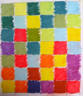
Please prepare a grid of 6 x 7 squares. Something like it is on the photo.
Take your coloured pencils or pastels or even your scraps of fabric and fill the squares of the horizontal rows as follows:
· 1. row: only cool colours (don’t think much, this is not a beaux-arts competition, chose your colours randomly.)
· 2. row: 5 cool colours and 1 warm colour.
· 3. row: 4 cool colours and 2 warm colours
· 4. row: 3 cool colours and 3 warm colours
· 5. row: 2 cool colours and 4 warm colours
· 6. row: 1 cool colour and 5 warm colours
· 7. row: only warm colours.
When finished look at the composition. Again try to collect adjectives to describe the sensation you get with the warm colours on the top and with the cool colours on the top.
Here is my example:

The warm colours feel much heavier. When they are down, the composition feels stable and static. The top is more airy.
Are the warm colours by the majority on the top, our sensation of balance is disturbed. A feeling of insecurity, incertitude is coming up and I expect those “heavy bricks” to fall down and crush all the airy cool bricks below.
So this is again a knowledge we can use consciously in our design. It works also on the horizontal level. Everything else being equal, warm colours generally “come forward” in the space. Cool colours, on the other hand, reced in our vision. Painters often take advantage of this aspect to create the illusion of depth.
Cezanne used this so called colour-perspective very often, especially in his still lifes:
Just two more examples. First Miro’s Figures at Night Guided by the Phosphorescent Tracks of Snails.
And second a Gee's Bend Quilt von Luisiana P. Bendolph: „Housetop“ Variation
In both the reds are just coming forward, creating the impression of space.
Contrast of temperature can also be used to create mood. Though reactions to colours are somewhat subjective and different from culture to culture, general tendencies apply. Arrangements dominated by cool colours typically evoke feelings of peace, quiet, serenity, and tranquility. Warm arrangements often bring about feelings that are relatively active and dynamic, from vivacity and joy to anger.


Colour is so fascinating!
ReplyDeleteand she did such an exhaustive presentation too!!
Delete