A TECHNIQUE DRIVEN Blog dedicated to mastery of surface design techniques. First we dye, overdye, paint, stitch, resist, tie, fold, silk screen, stamp, thermofax, batik, bejewel, stretch, shrink, sprinkle, Smooch, fuse, slice, dice, AND then we set it on fire using a variety of heat tools.

Monday, April 10, 2017

Colour – 4. Saturation: the sensation of inherent light

Saturation can also be called a colour’s intensity  and it refers to the relative purity of a colour. We can also think of it in terms of week and strong or dull and glowing. The more the colour resembles  the clear, fully illuminated colours reflected in a prism, the more saturated it is. The lighter of tw colours is not necessarily the more more saturated one. In the following two pairs of colours first ist he lighter one (yellow) and than is the darker one (green) less saturated.


When I add white to a pure colour it will be bleached, lightened, robbed of its intensity. These colours are often referred as tints or pastels.Saturation can be done on different ways:
  • Adding black to a pure colour results in deepening shades.
  • Mixing pure colours with already saturated colours will result in saturated colours. The most direct and powerful way to rob a colour of ist purity is to mix it with ist complementary colour from the opposite side of the colour wheel.
  • Mixing the three primary colours together should theoretically result in a perfectly neutral gray – provided that the starting colours the perfect primary ones.

On this picture you can see the tints and the shades of some pure colours and on the right their values (marked through the dots).

If you’re not so familiar with saturation I suggest to try to mix a five(nine)-step saturation scale:
  1. Prepare a horizontal row of five (nine) adjoining squares of the same size. (e.g: 1 x 1 inch)
  2. Fill the first square with a pure colour.
  3. With white and black paint mix a gray that is equal in value to your chosen pure colour.
  4. Paint the last (fifth or ninth) square with this gray.
  5. Using the pure colour and the gray you’ve mixed, create a dulled version which should be about halfway between those two. (pay attention, the mixing proportions are not necessarily 50-50%!) Paint the middle square with it.
  6. Now mix a halfway dulled version between the pure colour in the first square and the somewhat dulled one in the third(fifth) square and than repeat it with the colours in the third (fifth) and in the fifth (ninth) square.
  7. If you choosed to make a nine step graduation, you have to go on filling out the squares nr.2, 4, 6, 8, mixing always the two colours on their both sides, creating a halfway saturation in between them.

A colour can be pure or more or less saturated. So what’s the big deal about it?
The answer is a bit similar to what we saw at the value.
Again I prepared three grids:
  • One with a pure yellow, a neutral gray that has the same value as the yellow and a series of different saturations of these two in between.
  • Second grid with only little saturated yellows and grays
  • Third with nearly pure or very strongly saturated yellows in it.

If you have the time, regard them and write down your impressions in form of adjectives again. Try to collect adjectives with a positive and negative meaning (like serene and dull).


The first arrangement is quite powerful, dynamic, lively with tension in it. Could express agression maybe.
The second seems calm, quiet, more unified, less tension, almost subduded, boring.
The third is tense, vibrant, unruly, could work „hyperactive“.

But this perceptions are relative: a muted colour will seem to glow when seen among a group duller colours. This effect of „glowing“ is called inherent light. One would expect that the more saturated a colour is, the stronger the inherent light is. But actually the sensation depends on the relative saturation and doesn’t necessarily require prismatic, pure colours.The effect will appear stronger when the colours are closer in value. 

Beautiful examples of inherent light are Ad Reinhardt’s abstract paintings:


I will stop it here and if you’ve followed my post, take your time to reflect and sort out how the hue, the value and the saturation could help you to support your design. I will sum it up in my next post – along with some examples – and again we can compare notes. 

Friday, April 7, 2017

Colour – 3. Within the hue: Temperature

Colours are often described in terms of temperature as “cool” or “warm”. These psychological associations have a lot to do with certain physical characteristics, like red-fire-warm, yellow-sun-warm or blue-ice-cold, green-shade-cold. Still, the feeling of warm and cool is relative. The same color might appear cool in the company of warm yellows and oranges and warm surrounded by cool greens.
(I’ll look at it closer later this month when talking about contrasts.)

When thinking of the colour wheel, it can be roughly divided in half: warm colours stretching from red-violet to yellow and cool colours from violet to yellow green.
Before we go deeper into it, I’d like to make a small exercise.
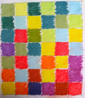
Please prepare a grid of 6 x 7 squares. Something like it is on the photo.

Take your coloured pencils or pastels or even your scraps of fabric and fill the squares of the horizontal rows as follows:
·      1. row: only cool colours (don’t think much, this is not a beaux-arts competition, chose your colours randomly.)
·      2. row: 5 cool colours and 1 warm colour.
·      3. row: 4 cool colours and 2 warm colours
·      4. row: 3 cool colours and 3 warm colours
·      5. row: 2 cool colours and 4 warm colours
·      6. row: 1 cool colour and 5 warm colours
·      7. row: only warm colours.


When finished look at the composition. Again try to collect adjectives to describe the sensation you get with the warm colours on the top and with the cool colours on the top.

Here is my example:


The warm colours feel much heavier. When they are down, the composition feels stable and static. The top is more airy.

Are the warm colours by the majority on the top, our sensation of balance is disturbed. A feeling of insecurity, incertitude is coming up and I expect those “heavy bricks” to fall down and crush all the airy cool bricks below.
So this is again a knowledge we can use consciously in our design. It works also on the horizontal level. Everything else being equal, warm colours generally “come forward” in the space. Cool colours, on the other hand, reced in our vision. Painters often take advantage of this aspect to create the illusion of depth.

Cezanne used this so called colour-perspective very often, especially in his still lifes:


Just two more examples. First Miro’s Figures at Night Guided by the Phosphorescent Tracks of Snails.

And second a Gee's Bend Quilt von Luisiana P. Bendolph: „Housetop“ Variation
In both the reds are just coming forward, creating the impression of space.

Contrast of temperature can also be used to create mood. Though reactions to colours are somewhat subjective and different from culture to culture, general tendencies apply. Arrangements dominated by cool colours typically evoke feelings of peace, quiet, serenity, and tranquility. Warm arrangements often bring about feelings that are relatively active and dynamic, from vivacity and joy to anger.


Wednesday, April 5, 2017

Colour Workshop - 2. About value

Value refers the relative lightness or darkness of a colour. Each colour has its equivalent on the grayscale, each picture can be viewed in black and white.
If you feel unsure at this point collect coloured papers in a line and try to define their value on a grayscale. Example:

You can repeat this exercise with your fabrics you intend to use on a quilt as well. (You can check your results by making a photo of your coloured papers and converting it into black and white.)
The question today is: How does value change make the difference in a picture? For that make the following exercise before you continue to read on.
Regard the following three grayscale-compositions for 30 seconds and write down 5-10 adjectives what characterize each grid best.


So let’s compare notes!

My adjectives for the first composition were: quiet, calm, open, light, airy, de-energized, free from tension, monotonous, boring, flat.

Second composition: calm, quiet, gloomy, cheerless, grave, dark, airtight, dense, flat

Third composition: strong, dynamic, vivid, full of suspense, vibrant, sensation of depth.

Of course, you might not be in complete agreement with my adjectives, colour perception is happening in the mind and we’re all different. But the main conclusion is, that full-scale values are very important for a dynamic composition.
It is not just how many hues you use but which values you have what makes the difference.
Black and white photography eliminates hue and saturation, leaving only value. Here is an example of my Cityscapes #2 in colour and in black and white.


The full-scale values (from light to dark) support the dynamic image of the city.

David Hockney has not used many colours in his A Bigger Splash, but he has full-scale values in the picture as you can see. Outside the splash, it is a very quiet picture. No action on it. But using full-scale values, from light to dark, prevents it to be boring. On the opposite it only increases the tension so the splash feels real. This is a very clever usage of the values.


Another example: Picasso painted his famous Guernica in “grisaille”, which is a term for a painting executed entirely in monochrome or near-monochrome, usually in shades of gray.
He uses light grays for everything living and very dark grays for objects and the background. This huge contrast creates a very dramatic effect supporting the story behind this masterpiece.

Well, this is about value. Pay attention to it, because it can underline what you want to express.
A tip: lay down your chosen fabrics, make a photo and convert it in black and white, controlling the values. Think of the adjectives you collected: which value scale evokes the kind of sensation you aim to create!

Monday, April 3, 2017

A blast from the past - Two workshops from our treasure chest

This is a series of posts by Beata who shared on the FIRE blog in 2013. These are the best post about color and composition I have ever seen. As a matter of fact I copied them into a word document and took my time going through the exercises.


“COLOUR IS MY DAY-LONG OBSESSION, JOY AND TORMENT” Claude Monet
Claude Monet: Rouen Cathedral
I know that this is a technique-oriented blog but in my eyes, any technique is as good as usable it is. And theory can give a foundation to technique – to use it more consciously. So In September I would like to make a series of theoretical inputs and connect them with exercises. I taught workshops on design principles where we also explored the principle elements of design.
There is not even a complete consensus on the principle elements of design but I consider 5 of them to be the basics: the line, the mark, the form and the space, the texture and the colour.
Colour is the most complex of them. Most of us handle it intuitively but I found that people appreciated to KNOW why and how colour works – so I choosed it as the topic of this month.
As I said I will make short theoretical introductions and give some exercises to try out. They will be rather short ones concentrating on the learning effect. So if any of you would like to do them and would send me the results, I would love to show them on the blog afterwards.
Joseph Albers: Hommage to the Square
OK, let’s get started!
We perceive the lights reflected from the surface of the object as colour. Colours that seem to be similar have nearly the same wavelengths. The perception takes places in the mind, so there is an immense “individual” aspect in it.
Each colour can be manipulated either by colour mixing or, more subtly, by altering the context in which they appear. And this latter one, the context, is which I would like to examine carefully.

There are three fundamental factors to specify colours: hue, value and saturation.
The hue is defined by the wavelength and generally referred as “colours” like green, red, blue, etc. The conventional 12-colored wheel shows the three primary hues: red, blue, yellow, the secondaries (always a mixture of two primaries): orange, green, purple and the tertiaries (mixture of adjoining primaries and secondaries). Different hues can be reached by colour mixing.  This is the part, which I’m NOT going to discuss this month.
But these hues, I’ll refer them as colours from now on, can elicit different sensations in different contexts:
  • Sometimes I perceive a certain colour in a context as dark, in another one as medium or even light.  Why?
  • Blue is considered as a “cold” colour. Isn’t there any “warm blue”?
  • And how can a colour sometimes be “bright” an in connection with other ones rather “dull”?


These are the questions I’ll try to answer during the next few days.

Friday, March 31, 2017

Friday AMAs #4

It's been wonderful getting to know many of you through our 31 Days of Stitch Challenge.  I hope you enjoyed the challenge as much I enjoyed bringing it to you and interacting with you all.

This is our final Friday AMAs (Ask Me Any) Questions for the month of March.

So ask me any questions that have been on your mind during this period.  I especially want to hear from all those who attempted one or more of the exercises or are planning to try them.  Just let me know in the comments:

  • If you're trying them 
  • If you're having difficulty
  • If you're having success
  • If there's a sticky point you'd need help with
  • if there's something you think I could have explained better.

Some of you have asked if I have a course where I teach my techniques. The answer is not right now. But I'm working on one.  So if you'd like to get notified when that course is ready, then let me know by going to Notify me About The Course.


I'll be waiting for your questions.  I hope we have a lot of questions today.
I want to say thank you to all those who asked questions.  For me, the interaction with you was my favorite part of this experience.

Warmest Regards,
Clara
ClaraNartey.com

Wednesday, March 29, 2017

Stitch Design Resources

As we near the end of our 31 Days of Stitch challenge, I want to give you some helpful resources. You can refer to them often on your journey to creating your own original designs with stitching. 

When you learn a new skill the beginning may be a little hard.. But when you practice, consistently over a period of time, it  will ensure that you see progress. Before you know it you will be developing mastery of the thread shading skills we’ve been learning this month.

So just keep at it.

1. I find that it’s easier to learn to draw on fabric by modeling drawing on paper. In this resource, there are several reasons why drawing on paper helps you become better at drawing on fabric.  And no, you don’t need to be good at drawing to use these techniques. And that brings me to the next resource.
2. If you can’t draw, you can trace. So use a photo of your liking and trace it onto paper first and then in combination with the techniques above, trace your sketch onto fabric with these fabric tracing methods.
3.Puckering is an issue that people often face when they start doing heavy stitching on fabric. With time and knowledge, you can learn how to avoid and troubleshoot puckering in your work. Check out this guide on  avoiding seam puckering issues.

That’s it for now.
Let me know if I can answer any questions for you.

Warmest Regards,
Clara

Monday, March 27, 2017

Shading/ Coloring with Fabric Collage


Up until now in the 31 Days of Stitch Challenge, we’ve used thread exclusively to color our drawings. Today, we’ll look at how to use fabric to color our drawings.

There are several situations in which you my want to add fabric collage to your work.

1. Background Fabric
When your background fabric is too light or too dark  to effectively show off your thread shading in a particular area.  

Instead of trying to use thread exclusively to achieve the effect you’re looking for, you can employ the use of fabric as an additional coloring or shading tool.

For example in this piece, creating the white petals of the flower on a black background would have required extensive stitching with white thread to cover up the black fabric.  Doing this would definitely have resulted in distortions in the fabric. So instead, I appliquéd white fabric in those areas and stitched on top of the appliqué.

"Luscious Pink" - Fabric Collage and Thread Shading on Cotton by Clara Nartey

2. Focal Point
Using fabric to add a pop of saturated color in your drawing is an effective way to create a focal point in your work and to draw attention to something in particular.

Take a look at this example.  I made the lemon a focal point in the drawing by using fabric to color it.

"Lemonade Makers" - Fabric Collage and Thread Shading on Cotton by Clara Nartey

3. Variety of Techniques
When you want to use different techniques in a single piece of work, fabric becomes very attractive as a coloring tool in addition to thread.
Take a look at this example. It includes, hand dyeing, thread shading and fabric appliqué.
"Bridge Builders"- Dye, Fabric Collage and Thread Shading on Cotton by Clara Nartey

Exercise:
Try the teacup example again. Use fabric to color part or all of your teacup.

That’s it for now.
Let’s go draw.

Warmest Regards,
Clara
ClaraNartey.com