Friday, June 24, 2016

Finishing and using eco-printed fabrics

Janine here...

After the cooking is done, and eco-printed fabrics have been allowed to rest, then dried, then gently laundered and dried again, and then ironed... what to do with the stash?


Below are the fabrics printed during a two day intensive workshop - yikes!


Some printed pieces can benefit from added colour. For example, the piece below was printed with Japanese maple, then rusted a little. I think that the rust colour is a good complement for the purple-grey.


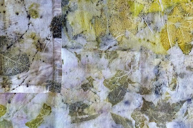
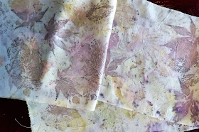
Ready-made silk scarfs can be purchased on-line, or printed from silk or wool scarfs from thrift stores. These made great gifts and often sell well.  Here's an example of a lovely complex print on a light silk scarf.


Although I love the results of eco-printing, I'm still learning about how to use them in finished pieces.  I hope that, if you are following this blog, you'll send along your ideas for finishing and using your eco-prints.  


I've stitched individual pieces that 'spoke' to me - keeping the stitching relatively simple to (hopefully) enhance the beauty of the print.  Here's an example:


I'm beginning to think about whether I could put several eco-printed pieces together to make a large, pieced work - here's one mock-up that I did recently - I add and subtract pieces... auditioning. The pieces are pinned to a piece of foam core - ignore the red, it's the carpet. :


I think that many eco-printed fabrics would make great journal covers. I haven't done much with journals yet. I greatly admire the work that Peta Bailey does with journal covers - see her work at studiopeta.com/blog/

Please, everyone, share your ideas for finishing and using your eco-printed fabrics - I know there are people out there who are doing wonderful things.


Back to Judith... and Judith,  I hope that you'll share photos of the eco-printed pieces in your recent show - the stitching was a beautiful complement for each piece.


Monday, June 20, 2016

More delicious-ness

Back with Janine...

I did a few more experiments with cooking bundles this weekend.  

In this one, which was steamed for about two hours, the Japanese maple gave me some lovely purple-grey colours, and a nice mix of dreamy shadowy leaf shapes and more distinct leaf prints.


This piece of old linen was also steamed - again, I really like the mix of subtle and distinct shapes, and the gentle colours. The plant materials were rose leafs and chopped maple.


This piece of silk organza took its colour from smoke bush - great purple-greys and olive greens. The smoke bush in my yard is just starting to come into bloom, and I included some of the unopened flowers - they made the spots that you see. What fun!


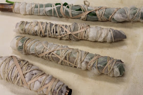
I tried one piece wrapped on a copper pipe (usually, I use a wooden dowel, a PVC pipe, or a piece of iron).  The results were very green, as I expected... even though I used smoke bush leafs.


Finally, the following two pieces came from a happy accident. I unintentionally left a bundle sitting in its bath for several days after the cooking. The bundle had maple leafs sandwiched between a piece of light linen and a piece of silk organza. The resulting prints are strong on both the linen and the organza - laid out next to each other in this photograph.


I wish I had some very colourful pieces to share with you but... you know, it's not my thing. I admire the work of others who get and love great colours.  Like my friend, Peta Bailey, who is a consummate eco-printer. If you want to see a glowing palette, check out her blog at studiopeta.com/blog.  She actually did some of the prints on a trip to France - I love the image of her wandering in a French village, pinching the odd leaf, buying old linen in a French market, and then finding a way to steam her bundles - what an adventurer.

That's it for me tonight - back to Judith.


Friday, June 17, 2016

Bundling with Lots of Artists

Judith says:
We've talked about material, mordants, leaves, and now we are on to the cooking process.  The first step is getting the leaves and the material into the pot.  The rule is that the leaves and the material need to be in firm contact.  After that rule almost anything goes.

Colour Ecology has a very nice post with pictures and instructions for bundling.  Kathy Beckett just finished a workshop with India Flint and had to try and document her attempt.


Colour Ecology folds her between boards then clamps them.

Becca Imbur also rolls and ties.  Notice the top one that looks like it maybe has a catalpa seed pod sticking out or it might just be a stick.


Threadborne wraps hers with copper to get that blue green color.


Lynda at BloomBakeCreate has been a guest artist on the Fire blog.  She has a nice post on eco-printing and two different types of bundles. Notice she is also using a copper pipe to wrap her fabric around and then is printing on paper with her flat bundle.


I personally have used the wrap-around-a-stick-or-copper-pipe method then using twine to hold the bundle tight.  I like a thicker twine for the strength.  I made the mistake once of using yarn which stretches when it is wet.  So not a good idea.  I have also experimented with colored twine and depending on the twine it can leave a very nice mark on the fabric.  Amelia Poole recommends using dowel rods wrapped in a plastic wrap as the center of the wrapped bundle so that the wood does not alter the color of the leaves.  Personally I like the more natural approach and use some almost straight sticks from my trees cut short enough to fit in my pot.  Do be aware that my sticks will give a less predictable result than Amelia's more controlled approach.


Wednesday, June 15, 2016

Cooking up delicious prints

Back to Janine...

Judith, thank you for sharing these beautiful prints. I love the colours, and the way you arranged your materials to get great patterns - clearly you're guided by your artist's eye!

Thanks also for sharing the links to Wendy Feldberg's tutorials. The on-line resources she's developed are pretty amazing. I highly recommend that readers check them out.

In this post, I'll share some of the things I do and the tools I use in the printing process.


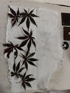
Getting ready to print, here's a selection of plant materials (Japanese maple, coral bell, and geranium leafs, and maple keys). Also wooden dowels - some wrapped in plastic to reduce transfer of colour between processes) and string.


Here are some of my favourite 'found objects' to add to bundles... All of these are iron - you can see that they've been used and carry the rust of prior cooking.


My cotton and linen fabric pieces have been mordanted, dampened, and I've laid out plant materials on two fabric pieces. I spray dampen the fabric before laying out the leafs so that I can increase the contact between the fabric and the plant materials. Sometimes, I use a rolling pin to flatten the leafs to the fabric as thoroughly as possible.


Rolled up and tied as evenly and tightly as possible - ready to go into the pot.


And I'll also make a bundle in which I will use Japanese maple folded into a triple layer with leafs between each layer.


Now I'll fold the fabric around squares of iron, and add a washer - just to see what it does.


All bundled up, and ready for the pot.


I just purchased this lovely cooking pot from a retiring wool dyer at a flee market - perfect!  It's big enough to handle my longest dowel.  I used this pot for cooking this time, and immersed my bundles in water with an unshelled walnut in in.


For small bundles, I sometime use this handy little steamer. I'm using it here to steam a few pieces that are already eco-printed... seeing if the colours will intensify with more heat.


 Ta daaa - the results of one dowel rolled bundle - in this one, I did not use parchment paper to prevent colour from migrating through the bundle. I like the multiple images of leafs on top of each other - complex and a little chaotic.


And here's what came out of the other rolled dowel bundle, in which I used parchment paper to prevent transfer printing. The colours and images are much more subtle, somewhat dreamy to my eye.  It may be that this bundle would have been more intensely coloured with longer cooking (the parchment paper may have slowed up the heating within the bundle).


One more bundle to open - the one with the iron squares.


I like this one - the way the leafs have printed in a bit of a grid, influenced by the metal squares. I'll probably do this again, with a larger piece of linen. I'll omit the washers though :-) 


Bear in mind that colours often change after pieces have dried - they often darken and can intensify.  I like to let pieces dry for a few days, then launder gently in a mild soap, then iron.

So there you have it - back to Judith later this week for more inspiration!


Tuesday, June 14, 2016

Moving onto Plant Materials with a link to Wendy at Threadborne


Hi,
This is Judith again.  I am a day late in my posting.  I can hear Beth grinding her teeth.  I hope the post is worth waiting for the pictures.

Today I am starting off with the artist for the day because she has a great post about the subject of the day.  Wendy at Threadborne has an extensive list and pictures of flowers, plants, and berries that will eco-print well.  Here is her tutorial on eco-printing.  It is in a great deal more detailed than my explanations have been and ever will be.

I thought I would share with you some of my best leaf prints.

This is poinsettia.  You can tell the difference between the red leaves and the green (yellow print on the left).  They are printed on silk.

I love the prints of strawberry runners.  The leaves also print but I love the runners the best. These are printed on cotton.

We used to call these cigars when we were little and pretended to smoke them. They are the seed pods of the Catalpa tree. Both the pods and the leaves print fabulous.  Do notice the blue that they produce.  The  pods were dry and brown.  It was my first attempt at printing something dried and it worked wonderfully.  The material is silk.


This print is from a bush in my woods.  I have yet to identify the bush.  I think it may be a dogwood species.  It has white flowers that are blooming now and I have never noticed any berries on the bush.  If you have a guess what it could be in Maine, please let me know.  The print is on cotton.

Okay these last two are not examples of leaf prints.  This is an example of a print I did not like that I then rusted.  Isn't it delicious?  See the washer on the left?  Before I rusted the material the print was just yellow.

Lastly, this is the benefit of using vintage/antique hankies.  Is the corner lovely?  And, the edges are already finished.  That is a huge plus for me!

Other leaves that I have had great success with are: peony, echinacea, rose, lilacs, Japanese maples, and geraniums.

I'll be back on Friday talking about bundling the leaves and material.


Friday, June 10, 2016

Kinds of images


Many things influence the nature of images you'll get, After you've prepared and mordanted your fabric, plant selection is the next decision you'll make. Which plant materials, and how you use them, will have a great deal of impact on your prints.

When I eco-print,  I aim for impressionistic, somewhat abstract images -  for suggestions of leaf shapes, rather clear crisp leaf prints. So I tend to lay out two, three, or more types of leafs on a piece of fabric, and I often tear or chop and layer the materials. The pieces below were done using this method. Looking at them will give you  a general idea of image and colour these types of materials can produce, but it'll be difficult to pick out distinct examples of what a specific material looks like.   I delight in letting the materials work with each other and the surprises that come when I open my bundles.

I want to tell you about some of my favourite plants and how I use them. My most reliable stand-bys are: rose bush leaf, apple tree leaf, sugar maple and oak tree leaf, and black walnuts (in the bath) . Bonus, these are not hard to come by! I often use these as a foundation and add other plant mateials.

Japanese maple, smoke bush, and coral bell leafs are favourites, probably because they tend to imprint well and often give smoky purple greys. The piece below shows a few smoke bush leafs fairly clearly, but also draws colour from other leafs, darkened and intensified by a healthy dose of walnut and iron in the cooking. The fabric is fine wool.


I also love the colours and prints that can come from raspberry and blackberry leafs, and from strawberry leafs and runners. The piece below shows the beautiful lines that can print from strawberry runners. You can also see leaf shapes - coral bell and apple. Note that the fabric (linen) is loosely woven and quite textured, yet it still printed well.


I particularly like a neutral palette , marked by plant materials. The piece below shows the dotted lines of strawberry runners - aided by chopped sugar maple leafs, which just showed up as sprinklings and pale, shadowy images. The fabric is a linen serviette.


Sometimes leafs will imprint with sprinkles of colour... in this cars the purple is probably from coral bell leaf


 Sometimes there are tracings of leaf shapes - the one below is from town sugar maple leaf


Catalpa pods,below, make a very distinctive print, and I often use them to make distinct, mysterious marks..


In all of the pieces I've shown you here, the materials worked together in the bundles to influence the intensity and colour of the print. And colours can also be affected by the other bundles, and what's in the bath if the bundles are immersed for boiling rather than held above the bath for steaming.

For those of you who prefer distinct, identifiable images of specific leafs, here are a few suggestions that will help you to get what you want.
- place your piece of fabric on a piece of parchment paper, which you will roll up with the fabric. The paper will prevent transfer of colour or image from one layer of fabric to another.
- lay out each leaf, stem, or flower so that it can come in full contact with the fabric - i.e. so that there isn't a stem of other leave overlapping.
- steam the bundles rather than immersing them for boiling
- reduce contact between bundles in the steam chamber either by keeping a bit of space between them, or by wrapping each bundle in parchment paper.


Wednesday, June 8, 2016

Coloring the prints and Kit Eastman

Hi, this is Judith!

Isn't Janine great?  I learned so much from her post.  She has so much more experience with different mordants than I have.  Cris Winters had asked for lots of mordant information and thankfully Janine was able to help with that.  Janine also talked about Amelia Poole. We are very lucky to have her in Maine. She often does workshop and Janine has attended two.  I see Amelia at least yearly at craft fairs.  Her paper and fabric prints are among the best that I have seen.  I really love her because gets a really good print rather than fabric with a blurry shape and great coloration.  I prefer the print since I am a printer and Janine prefers the fabulous colorations.  Isn't it nice to be the same (we both like eco-prints) and different (we call different effects "success")?

Before I start, I apologize for the horrible pictures.  I'll try again with natural light and replace these if the pictures are better.


I wanted to tell you about my experiment with iron.   I always use iron in my boiling pot and believe it gives a darker print. Above are the iron pieces I generally use. Sorry the picture is horrible. I believe they are old spark plug tools.


Kinda by accident I tried using some iron after the boiling.  I tried eco-printing fabric with the results of lovely soft browns and only a few very light prints. Can you even see the prints? Two leaves are there but you have to work to see them.


 I decided to do some rusting on top of them. After letting the fabric sit for a couple of weeks and ironing it in an attempt to set the eco-prints I had I sat the fabric in vinegar and weighted it down with washers.  Lo and behold after just a few hours here is the result I got--the color of the fabric changed and the print was significantly more distinct.  There are so much better in person and in focus.


Speaking of the lovely soft brown I got on the fabrics, they were different than my normal results and I think I know how I got it.  I have a long strip of birch bark that I thought might be useful for something.  When I was boiling the fabric I added the birch bark.  I wondered if since the leaves print well the bark would change the color of the prints.  If nothing happened, I thought that at least I would soften the bark and be able to shape it.  The results after boiling was the soft browns.  I don't know that the birch bark made the difference since I have not repeated the experiment but I thought I would mention it.

I have also tried using other materials to color the prints.  Copper  is supposed to increase the green/blue of the prints.  I have used a copper  pipe both in the boiling pot and as a rod to wrap my fabric/leaves bundle around.  I personally have not noticed a significant difference in color.  I have also added avocado pits and peels to the boiling water. That is supposed to make the prints more yellow-green.  Again, I could not really tell a difference. I am not saying it doesn't work--lots of other people have had success with it--but so far I have not.  Could be I am looking for huge differences rather than a subtle change.  Could also be since I always use iron the color from the iron is more dominant.

Artist: Kit Eastman

This is how Kit describes herself taken from off her blog:
"I use the materials and techniques of a traditional Japanese textile art called katazome (stencil dyeing) to capture my experience of a natural place.  My materials - cloth, rice paste resist, soymilk, natural dyes and pigments - engage my senses. The process creates a centering rhythm and a space for reflection."

I love her Katazome prints but she also does some eco-printing.  I love it because they are so complex, certainly more than I have ever attempted.


Isn't that even lovelier than you ever imagined?  Here is the process she used:

"Started with ecoprint bundles around my favorite fall leaves simmered in madder; then painted some natural pigments on that … followed by a rice paste layer of my water stencil, using some thin tracing paper as a mask. More pigment layers and curing to come".

Here is another of her eco-prints.  The process has many steps so I am not going to even attempt to explain it but she does a really thorough description that is worth reading and then trying.


Tuesday, June 7, 2016

Finally Back in Stock!


Slow Stitch: Mindful and Contemplative Textile Art by Claire Wellesley-Smith is finally back in stock!  I have been very impatiently waiting for this book!   Amazon will have copies of the book on June 12.  I already have my order in.

Monday, June 6, 2016

More about fabric and mordants

I’m Janine Gates - the other half of the eco-printing team for the month of June. I am not an expert on all things eco-printing - but for the last few years I’ve been an avid learner. I began eco-printing after taking a workshop with the gifted Canadian fiber artist Maggie Vanderweit (http://www.stonethreads.ca).  I was a member of Kingston Fibre Artists (http://kingstonfibreartists.ca – I miss you women!) and I was lucky to connect with fellow artists in that group who were also inspired to continue eco-printing after Maggie’s workshop. We had a blast and learned a lot together.

I moved to Maine in 2015 and discovered Amelia Poole – another wonderful teacher and fiber artist (http://ecouturetextilestudio.com). Two excellent workshops with Amelia taught me lots more, and I continue to be inspired. Here in Maine, I’ve had the good luck of connecting with Judith – we share a passion for eco-printing and fiber art generally.

Judith has laid out the key information about eco-printing in Friday’s post - I’ll add a few things that I think about when printing. 

Eco-printing is sometimes called contact printing – that term is helpful to me because the better the contact between the plant materials (leaves, stems, pods, petals) and the fiber, the more successful the print is likely to be. Judith and I will talk more about how to maximize plant-fiber contact later in the month, when we talk about preparing the bundles.

Many kinds of fiber can be eco-printed. I like to repurpose fabrics – I troll second hand stores for linen, cotton, silk or light wool garments and linens that I use for printing – white, cream or even pale colors work well. Silk or wool scarves are great, and a light wool shawl or throw is always a welcome find. I also love to print silk organza, which I order on-line.


 Three linen and cotton pieces printed with torn sugar maple, birch, and an assortment of other leafs


Silk scarf printed with Japanese maple, raspberry, and apple tree leafs

  
I scour fabric before the mordant soak – even old, worn, second-hand linen or cotton that has been washed many times may have bleach or detergent residue.  I generally use very hot water with a little synthrapol and soda ash to prepare these fabrics to take the mordant.  For wool and silk, I do a warm water wash with a gentle, neutral soap. If you want to know more about scouring, the Maiwa website has good instructions (http://maiwahandprints.blogspot.com/2010/12/natural-dyes-scouring.html).

Some thoughts about mordants

Protein fibers (like silk, wool, and alpaca) take prints beautifully using a simple alum mordant. Cellulose fibers like cotton, linen, viscose, and paper print less readily and can benefit with some extra preparation when mordanting.

Here are two ways to prepare cellulose fibers for eco-printing:

Soy Milk Soak
Some people have had good results from soaking cellulose fibers in soy milk before the alum soak. The soy milk is intended to infuse cellulose fibers with protein, increasing the effectiveness of the print.  I’ve used this method, and it did help to improve the print color and quality.

Aluminum Acetate
Amelia Poole introduced me to this mordant for cellulose fibers and I’ve been very pleased with results. Aluminum acetate can be purchased on line through various sources.I purchased mine at Dharma Trading. (http://www.dharmatrading.com/dyes/aluminum-acetate-mordant.html). This mordant can also be mixed in your own studio (I haven’t tried this) - instructions can be found on the Maiwa website. (http://maiwahandprints.blogspot.com/2013/01/natural-dyes-mordants-part-1.html ) This site also has a great deal of information about eco-printing and natural dyeing.

Using mordants can be a complex, multi-stage process.  I’m a simple soul… so far, I’ve been pleased with results I’ve had from just using alum (for silk or wool) or aluminum acetate (for cotton, linen and paper). I do almost always use iron (which is a co-mordant that can enhance uptake of images) somewhere in the eco-print process.  I don’t measure the amount of iron – I  introduce it to the process by wrapping rusted iron objects among the leaves in bundles, or by placing a piece of rusty iron in the dye bath, or by adding a very rusted piece of fabric to a bundle or to the dye bath… or all of those methods.  I find that iron helps to make colors darker (saddens the colors) and prints more distinct – this suits me but you may be looking for different effects in your eco-printing. Many plants that I like to use contain tannin, another co-mordant – for example sumac and maple leaves – and I often use these in bundles.

If you’re interested in learning a lot about how to use a full and varied range of mordants, the Maiwa website is a good information source for that too. Having more information about the effects of various mordants, and when and how to use them will give you more control over the process and results.   Most of the time, I don’t try to aim for specific effects – I love the elements of chance and surprise that are intrinsic to eco-printing… the thrill of opening those bundles to see what the process has given me. More about those little bundles in the weeks ahead.

How much mordant to use? Like Judith, I weigh the dry fabric that I’ll be eco-printing and compute the corresponding amount of mordant needed for that weight. For cellulose fibers, some eco-printers recommend a ratio of 15-20% aluminum acetate mordant to the weight of fabric; others suggest a lower ratio of 5-10%. I generally use a ratio of 10-15% and have been happy with results.  I find that I can use less mordant on thinner fabrics, or when I know I’ll be using plant materials that tend to print well. And if I know that I want strong, distinct prints of specific leaves, I’ll often use the higher ratio.

Back to Judith for the next post – happy printing!