Tuesday, March 31, 2015

Goldilocks and the Three Bears of Finishing

I had hoped to have a couple more pieces finished to show you but, alas, they are not finished and I have lost my camera (again) and can't even take a picture of them unfinished!  Still I wanted to to just thank you all for the wonderful comments you have made this month.  As you can see, I have learned a lot this month.  Just bears out to me the importance of practice and experimentation.  Thanks for taking the journey with me.

 Now on to other important issues such as how to finish my pieces.  I have debated for weeks on how to finish my pieces.

Once upon a time, Goldilocks had made some screen printed fabric she wanted to finish for showing.  She was not sure how to do that.

Quilt:  She really did not care to quilt them.  She thought they looked good enough to not need quilting.  She did not want to quilt just for the sake of quilting.  Also She was worried that they would be limited to quilt shows rather than art shows.  Just too soft an approach.

Stretcher Bars:  She debated stretcher bars and even bought the wood to make them.  But she was worried that putting them on stretchers would make them too much like a painting and would lose the fabric quality of them.  Just too hard of an approach.

Art Cloth:  Beth showed her a short video by Jane Dunnewold showing how she finishes her pieces.  Jane fuses them to felt, leaves the edges completely unfinished, and hangs them on metal bars.  She calls them Art Cloth.  For Goldilocks this was the just right approach!  Still fabric but not distracted by lots of quilting.  Probably not accepted in a regular quilt show but absolutely acceptable in an art gallery.

Decision made!  This Goldilocks (thanks to hair dye with a wonderful free squirt bottle) will finish her printed pieces as art cloths.

The End

Friday, March 27, 2015

Second in Missed Beat Series

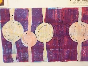
I am not repeating all the information from the last post but here is the second in the Missed Beat series.

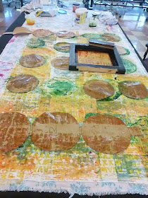
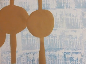
Process Pictures--some show the brown paper I used as a mask.


Finished and hanging. 


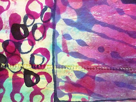
Two detail shots.  Oh, and the circles were looking a bit muddy after several layers of deconstructed screen printing so I squirted some Decolourant on them, dried, set, washed, then overprinted the entire circle with a masked screen and an intense blue thickened dye.


Just a note of self-congratulations.  When this piece was hanging in the studio, an artist/art instructor from UMA walked by.  He stopped, studied it for a while, then asked if I wanted to show in his gallery.  One guess my answer!

Linked to Nina-Marie

Wednesday, March 25, 2015

First in Missed Beat Series

Recently I discovered that I have an occasional irregular heart beat.  Doctor says that most people have an occasional irregular heart beat and it means nothing.  In fact, now that I know it means nothing I lay in bed at night listening to my  heart beat and think it is cool when I hear (well, actually don't hear) the missed beat.

I am telling you all this in order to introduce my Missed Beat series.  I am taking a print class at UMA and am working with thickened MX dyes on fabric for my prints. Fabric is 60 inches by 36 inches. Now it is a print class so I am printing with multiple deconstructed screens rather than painting but drawing with thickened dye is included in the work.  And, the deconstructed screen is used as texture and specific shapes rather than just a one-off print of the screen.

Below are process pictures and then the finished piece.  I am pleased.  All that practice with drawing lines was definitely worth it.  Enjoy.

First layer batching under plastic.

A screen after deconstruction.

Brown paper to cover shapes while I work on the background.

Finished background.  Now time to work on the shapes.

I don't show  you but I used more brown paper to cover the background while I worked on the shapes.


And then I drew lines.

 Details of lines


Detail of background.

 Brought to you by Judith

Monday, March 23, 2015

Quality of Line

Lets go back to this wild child.  It is a  wild child for sure.  Here it is washed out.

I was hoping for an exciting piece.  I needed a bold statement line to get that effect.  Now with the bubbling of the thickened dye I got a bit more wild child than I had intended but I like it. It would have been a very different  piece, a Miss Manners piece, if I had chosen a different quality of line.  Not saying that is bad.  Just saying it would have been different.  So lets look at some of wild child's lines.


The fabric was dry (which probably increased the bubbling situation) but I laid all the lines down in one sessions and the lines bled into each other.  Isn't that great here?  Didn't work on other pieces like the IRO inspired pieces but is great for this one.


The washed out wild child was unbalanced.  I had used too many dark colored lines in some places and too little in others.  I needed to balance it.  More lines in its future.  Beth said she got a consistent line by putting the tip of the squirt bottle on the fabric.  I tried it. See that straight line up the middle of the picture? And the navy blue circles?  UGH!  GAG! Good line for somewhere else but it did not fit with the rest of the piece.  The wild child was just not that well-behaved and sedate.


So, worked on stronger lines but I was working on a new layer rather than with all the lines wet and bleeding into each.  See the difference? The new line doesn't play as nicely with the others.  But it is worth noting that it is more distinct.  Good to know for the future.


I had great fun with the wild child.  It took me three dye sessions to get her finished but so what.  Rome wasn't built in a day.  And I learned a lot about drawing lines with thickened dye.

Brought to you by Judith.

Friday, March 20, 2015

Now we are having fun!

Searching for cool art on the internet I found the work of Lena Nyadbi and Betty Mbijana.

First Artist Inspiration

"Lena Nyadbi is a contemporary Indigenous Australian artist from the Warmun Community in the Kimberley region of Western Australia." More information about her can be found here.  Isn't she fabulous?  Her is the picture I used as one inspiration.


I started out with a pink and blue screen print that I hated. Then I squirted lines on it.  I like it better but the line quality is all wrong. Don't they look like your sex education class drawings of sperm?  This piece definitely needed painted lines rather than squirted bottle lines.


Second Artist Inspiration

"Betty is a hard working artist, whose works are very popular and have wide appeal. 
The paintings are aerial views of women's ceremonies and depict the waterholes (often in sacred places) where they take place." She does not have a website but here are more images of her work.  This is the one I used for inspiration.
  So starting with a yard long piece of cotton that I had already done some surface design on I started drawing trying to emphasis the underlying designs.  Of course I was using my handy dandy hair-dye squirt bottle.  She used a brush to create hers.  I am still trying to master my squirt bottle so ...


Because the cotton was very tightly woven the dye did tend to bubble more than it would have on muslin.  You can really see the bubbling on most of the pictures.  Since I didn't care whether the lines were perfect or not (think of it as an element design) just kept going.


See the copy of the inspiration art in the above picture?

Brought to you by Judith

Wednesday, March 18, 2015

Intent and Line


I don't know if you read comments or not but I have gotten a few comments about my use of dye to draw lines.  I think those are good comments and deserve some discussion. The technique I use for a line depends on my intent and on the quality of line I think will get the job done.

One artist said she uses a stitched or quilted line in her work.  My self-portrait above is a good example of using stitching to create a line.  As my mother told my soon-to-be husband, I have the "soul of an artist."  Now my mother meant that I don't clean house but I wanted this small wall hanging to show my artistic soul and downplay my physical habitation. That was my intent for this piece. So, I used ink to give the background some color, to move it into the background, and to ground the figure so it was not floating.   I finished the background with some meander quilting for texture without drawing interesting to the stitching line.  I used bold commercial fabric for the shadow to really make a statement but be dark enough to be the shadow. AND I used a stitched line for the figure because I wanted a thinner, more delicate line to show details.  Drawing a dye line would have been too strong of a line for the intent of the piece.  It would have said something different than I wanted the line to say.  So, I chose a stitched line in this case.


Another artist said that there are so many different options to make a good line why did I bother with the dye. Again that is a good point and is answered again by asking, "What is the intent for the piece and what type of line is needed?"  In this snow dye piece I saw a flower garden and wanted to enhance that.  For this line I used a micron pen.  It gave a solid consistent thin line that I wanted for the piece.  That worked well because I knew I was going to use some chalk (also known as fugitive media) to enhance the flowers so I could "fix" it all when I was done. A dye line would have taken away from the delicacy of the flowers.  A stitched line would have been difficult with so many individual petals.

So why am I using a thickened dye line in these pieces?  

First, Intent.  Right now in my art career I am spending more time in surface design than in sewing.  Right now my goal with each piece is to create an artistic design that stands alone.  Or in other words, doesn't need stitching or quilting or thread drawing to complete the design.  I want to create something that could be framed or stretched without adding any embellishment to it.  That is my intent so I am experimenting with a thickened dye line. 

Second, Quality of Line.  I want the line to be bold, obtrusive, an independent voice in the design. I want it to be free and loose and have some texture of its own.  I want it to have weight. I like the work that Ayn Hanna is doing and so I am experimenting to see if I can produce such a line to incorporate into my work.

Good news is that with practice my lines are getting less gloppy and blobby and are starting to say what I want them to say.  Stay tuned.

Brought to you by Judith.