Friday, September 30, 2011

Artists: Start Your Engines

Plug in your irons, warm up your stencil/solder irons, and get those heat guns out.  It's nearly October and while the weather is still warm enough to work outside, we're going to really heat it up.  That's right -- I may take things a little bit literally sometimes, but it's time to set it on fire!


OK -- not really open flames, but I want to explore the effects of heat on textiles, Tyvek, Lutradur and other poly/interfacing type substances.  And anything else that might be enjoyably altered by a judicious application of heat.

One last post about Fugitive Media

I have really enjoyed this month of working with fugitive media.  I have tried lots of different media and have only scratched the surface of the possibilities!  I might even get really brave and use the media to not only enhance a dyed fabric but to draw something like Karen did with her heron.  Here is the heron appliqued  onto her quilt. Stunning is the word I would use for it. If you are also thinking about using fugitive media to create your own drawings, here is one last suggestion for you.

Here is a free ebook offered by Interweave on Pastel Painting.  The techniques and processes he describes can be used on fabric!   While he is using pastels, the color theory and layering he describes could be used with water-soluable pencils or crayons too I think.   Just remember:
  1. The pastels must be chalk or water-soluble.  Regular pastels have an oil base that will repel the bonding liquid.  If you use a regular pastel, it will wash out.
  2. Take care with the layering that it is not so heavy as to block the bonding liquid from actually wetting the fabric. That is needed for the bonding to occur.  It is possible to wet with the bonding liquid after each layer, let dry, and then add the next color layer if  needed.
  3. Use a bonding fluid such as base extender, 50/50 glue and water, acrylic media, etc.
  4. IRON it to heat set it.

Thursday, September 29, 2011

We Meet!

I didn't take any pictures but Beth Schnellenberger and I met for the first time this week! We have been blogging friends for a couple of years but had never met in person.  She lives in Indiana and I live in Maine.  Not all that close.  However, this week I am in Indianapolis attending a conference for work so we got together for dinner.

What fun!  I got to see some of Beth's wonderful quilts in person,  laugh at her jokes, eat while she talked, compare quilting notes, and play the "Who Do You Know That I know" game.  She and I have a lot in common I think.  We both started out as traditional quilters who got bored.  We both try not to laugh (cringe, hide, feel like we are stretching the truth)  when we call ourselves "Artists."  We are both working at identifying our voices; with the help of other artists we are getting an idea.  In fact we discussed that quite a bit.

Beth is taking a class with Jane Dunnewold.  Jane pointed out to Beth that she not only had a style but she had already produced a series of three quilts.  Beth was stunned.  She didn't know that she had either.  I didn't know I had a style until I started playing with FIVE and they told me what it was.  Why is it that we can't see our own progress and recognize our own work?

I wish this paragraph had the answer to that question but the bottom line is that I don't know.  I know that it is true for Beth and me.  How about for you?

Judith

Fugitive Medium plus Wen's Workshop

I promised you more pictures from the SAQA Maine Event that included prints made during Wen's workshop in the morning and then enhanced in my fugitive media workshop in the afternoon.  Here they are.

 That's Wen.


Wednesday, September 28, 2011

A Fugitive Medium Experiment

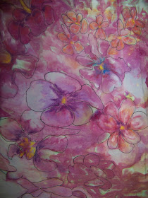
Today I am being an artist/scientist and experimenting.  I have two pieces of fabric that I ice-dyed at the same time.  The two fabrics looked very floral to me so I decided to enhance that fabric story.  I then drew petal shapes around dye blobs on both fabrics with a micron pen. So far, I have treated them the same.

For my independent variable (or is it dependent variable?  I get confused) I used two different fugitive media.  For one I use water-color pencils--not inktense--and for the second I used chalk pastels.

 I took the two samples around to everyone in my office for their opinions about which turned out better and why.  Very interesting results.  So, which do you like better?  I am not telling you which one is the pencil and which one is the chalk till I get some input from y'all.  So, with some pictures closer than other and in no particular order--

One

Two

Three

Four
Five
Six

Monday, September 26, 2011

Fugitive Media - watercolour pencils and crayons

Kit here.

I tried the fugitive media this weekend using watercolour pencils and watercolour crayons. 


I started out with a piece of my hand-dyed fabric (from when I was attempting make mandelas with procion MX dyes),


and with a watercolour pencil, I enhanced the fuschia lines that were already dyed in, and added blue at the ends of what I imagined were petals. 


Also with watercolour pencils, I added some green. I just left it in the "lined" state as I knew once I added some water, I would be blending. I used a flat, square paint brush with hard rather than soft bristles for the blending.


Then, I used my watercolour crayon to add some more depth to the petals.  (I was working outside in the garden, so as the sun moved around it created shadows on my work.)


After that, I used a charcoal pencil, made "feathered" edges at the ends of the petals. Then I used my paintbrush dipped in water to blend the colours I'd added in.  In retrospect, I'd do the charcoal step at the end, when my petals were done, rather before;


because after I drew in the petals with the watercolour crayons, I had this odd circle shape.  Lesson learned!


I then painted on a mixture of half and half base extender and water, and let it dry. And now all that's left with this is to decide what to do with it.

I've also bought some pastels and will be trying that next.  I'll post about it in a couple of days.

Cheers,


Friday, September 23, 2011

Fugitive Media

Finally, I've had some time to try out this technique! I used some regular pastels on white fabric, just drawing some flowers out in various colors. Then I painted the whole piece a very light lavender using Pebeo Setacolor paint, covered it with textile medium using a screen, and quilted some outlines in black. Here's a picture from late last night when I finally had to put it away and go to bed:

More flowers. It was a lot easier to draw the flowers out first, then sew around them. The textile medium I used seemed to create almost a laminate type of fabric. Definitely gave my sewing machine needle a workout--I want to wash the piece to see if it softens up a bit.

And here's another piece I painted some flowers on with setacolors in pink & yellow, then drew the leaves in with pastels. I learned that the setacolors are pretty transparent and the pastels aren't, as you can see in the leaf on the right side.


I took the textile medium and applied only to the green parts with a brush, then heat set the piece with my iron and threw it all in the washing machine. No fading or anything following the wash.


Finally, this last piece was from the challenge we had recently--there was too much white on it when I got it back, so I decided to color in the white lines with a blue pastel crayon. It actually looks purple in this picture, which makes me thing I might want to color it over in purple.


I screened the textile medium on this, too, and washed it, but it still feels kind of stiff. I just got a cheap medium at Joann's or Michael's, if someone is using a better one that doesn't stiffen up the fabric, could you tell me which one I should try?

Monday, September 19, 2011

Fugitive Medium at the 2nd Annual Northern New England SAQA Weekend

How about that for a title?  I chose fugitive medium this month knowing that I was going to be teaching a workshop at the SAQA Weekend.  I basically showed some examples of chalk, charcoal, cretacolor aqua bricks, watercolor pencils, inktense pencils, water-soluable crayons (did I miss something??) art work on fabric and told the participants to go to it.  And they did!  Here are some examples of their work.


 The workshop before mine was presented by Wen Redmond and was Tracking the Wild Print.  She showed how to use plants to create a direct, shadow, and ghost prints.  Those prints made fabulous first layers for enhancement with fugitive medium.  More pictures later showing that wonderful collaboration.

Thursday, September 15, 2011

Inktense and Aloe

I needed an appliqué for a journal quilt I was doing and someone mentioned Inktense pencils, so I got mine out and drew this crane.

I stabilized the fabric by ironing it to a piece of freezer paper.
 The last time I wet my Inktense pencil drawing, I got it too wet and the color ran off the edge, so this time I used some clear aloe vera gel and tiny brushes.  I got tired of all the little brush strokes (and I was in a hurry) so I got out a bigger brush and really wet it down with the gel.  Then I placed it gel/pencil side down on a clean paper towel, placed a piece of parchment paper on top and ironed it with a hot iron until it was dry.  Then I rinsed it with cool water and pressed it again.
There is just a tiny bit of bleeding off the edges, but it's much better than it was with the water.  And I had a lot more control with the gel.  The color is still really vibrant after the rinse.

Wednesday, September 14, 2011

Judith's Charcoal Technique

Hi Everyone!  Things have been busy in my world, not leaving a great deal of time for my creative endeavors.  However, the last week has been husband-less which means our business can be ignored for a few days, so I've been free!  Here are the results of the Round Robin which "5" had going over the last few months.  From left to right the fabrics belong to Beth, me, Charlene, Rosalita, and Judith's is the horizontal.


Below is a photo of the beautiful snow dyed fabric made by "5" member Charlene.  The series of techniques used on this piece were silk screened gold by Beth, fugitive charcoal by Judith, and silk screened cranes by me.


I wish that I had a photo of the original snow dyed fabric to show, but here's a close-up of Judith's fugitive charcoal technique:


Picking out areas to treat with the charcoal added so much dimension and direction for the eye that it defined the piece once and for all as solar.  I love that Judith was able to use the circle to focus in all that wild beauty.


And here are Judith, Beth and Charlene of "5" at my studio on September 3rd.  We're doing ice dyeing outdoors on a beautiful day.  Note the sports bra that Beth is working on!  Maybe she'll post a pic of her finished garments.  They certainly looked intriguing coming out of the dye!

Throw 'em in leg irons so they won't escape!

It occurred to me last night as I was trying to go to sleep that I have not stressed the importance of heat-setting the fugitive media after you coat it with the base extender.  IRON IT!  Until it is captured by the iron, the media can still escape your clutches!

Tuesday, September 13, 2011

Chalk as a Fugitive Media

Chalk is one of my favorite fugitive mediums.  First because it has more control than many of the other mediums.  Second, it is inexpensive.  I picked up this box of 48 chalk pastels for around $5 at A.C. Moore.  So, let me show you what it can do.

This is a ice dye fabric I made last weekend in a play date with the FIVE.  It is looking like flowers to me and I want to enhance that.
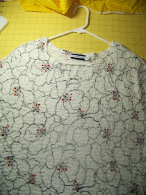
I am using this shirt of mine as a model.  I like the way the  petals are defined and want to try and attempt the same type of affect on the ice dyed fabric.
I used a micron pen to outline some petals.  I just kinda drew around shapes in the dye.  No formula or pattern here.  Then came the fun part. 
I started by drawing straight onto the dry fabric with pastels.  I didn't add color to every petal but only to those that fit into an entire flower unit.  The chalk is subtle so it does not block out the background colors but does add to it to make the flower more cohesive.  On the flower on the bottom right I added purple.  The one of the bottom left I added white--the purple was already there. The top left flower I added a light blue chalk.  Top right I added orange and yellow-orange.  I rubbed the chalk lines with my finger after I drew with the chalk to help them blend in.  I could have chosen to leave the chalk lines more distinct if I wanted.

Once I had the amount of color I wanted, I painted the chalk flowers with a 50/50 mix of water/base extender.  I used a small paint brush because I didn't need to paint the entire fabric--only the part that I added color with the chalk. Here is where the control comes into play that I had talked about before.  With colored pencils or crayons, the colors will blend and bleed. The chalk doesn't.  You do the blending with your finger while it is dry.  When you paint it with the 50/50 mixture, it does not run.  Yeah!

Once the flowers were wet, I decided the bottom right flower needed a bit more color so I added the pink.  The bottom left flower needed some more white so I added it too.  You can tell because the lines are a bit more distinct on the wet fabric than when I added chalk to the dry fabric.  I am quite pleased with the results.

Monday, September 12, 2011

Congrats and MORE Congrats

Two pieces of wonderful news I want to share with all of you! 

First, Kit Lang has agreed to join the blog as one of the resident artists!  Here is a link to her blog if you have not met her yet.  Please give her a warm welcome!

Second, Beth Berman has been asked to be one of the SAQA Regional Representative for New England. She will be replacing Wen Redmond who has resigned to devote more time to her art.  Beth has also been asked to participate on the planning committee for the national SAQA conference.  Congratulations, Beth, that your creative talent, organizational skill, and passion for supporting and encouraging others have been recognized and put to work!

An old post and a new one

Here is a link to a post that Laura already posted about using inktense pencils.  I love her work and think her post along with the post from Rosalita do a good job of showing you the possibility of colored pencils.  In my own experiments with colored pencils I used both inktense and regular water-soluble pencils.
Frankly the only difference  I have noticed in the two types of pencils is that the inktense pencils only blend the first time they get wet.  Regular water-soluble pencils will bleed/blend each time they get wet.  I will use both types on a fabric because the colors are different and it expands my possibilities.